Line item extraction: AI powered document review experience
Project Timeline: 3 Months

My Role
Team
Project Brief
Impact:
Reduced manual entry work saving an estimated ~50,000 accountant hours per month.
I designed the bank statement review experience inside QuickBooks so accountants can upload a PDF bank statement and get all transactions extracted, reviewed, corrected, and imported directly, without manual entry or third‑party conversion tools.
Bank statements sit at the center of two core accounting workflows: creating bank transactions and reconciling the books. QuickBooks didn't support PDF statements for either, so accountants paid for tools like Dext, AutoEntry, and MoneyThumb to convert statements to CSV — or corrected extractions by hand, roughly 30 minutes per statement.


In QuickBooks accounting workflows, bank statements are used both to create bank transactions and to reconcile the books. QuickBooks didn't support uploading PDF bank statements for either task.
So accountants relied on third‑party tools — Dext, AutoEntry, MoneyThumb — to convert PDFs into CSV before uploading, each charging an ongoing monthly subscription on top of their own services. Accountants who avoided those tools corrected extracted data by hand in tools like Adobe Acrobat, at roughly 30 minutes per statement.


Building PDF upload and extraction directly into QuickBooks — and automating extraction of transactions from those PDFs — would eliminate the third‑party cost and the manual correction overhead, unlocking an estimated 50,000 hours of accountant work saved per month.
The cost of inaction wasn't neutral: every month this stayed unsolved was a month customers kept paying competitors for a job QuickBooks should own end to end.
Two personas shaped every decision
The review experience is shared, but the two audiences bring very different levels of domain expertise — and, as research later showed, they disagree on what "helpful" looks like.


Watching how accountants actually process a statement
How we did it
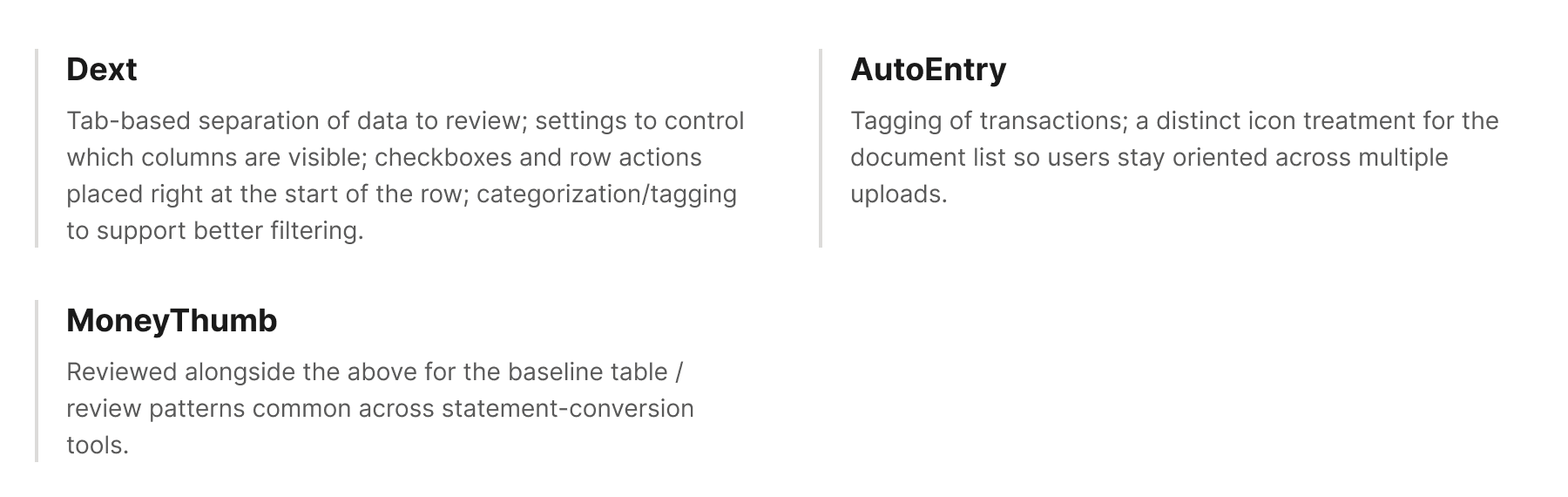
I talked directly to accountants and joined Follow Me Home calls to watch how they process bank statements today — before proposing any solution. In parallel, I ran a competitive study of the statement‑specific tools accountants already pay for (Dext, AutoEntry, MoneyThumb) to understand what a "good enough to trust" bar looked like, and where our existing single‑field review widget fell short for line‑item documents.
What we learned


Competitive teardown — what carried over

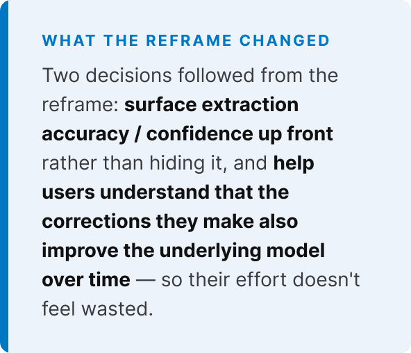
The reframe from discovery


Naming the assumptions, then mapping the journey
Leap of faith assumptions (LOFA's)
The beliefs the design is built on. If any of these are wrong, the core value proposition breaks down — so each one is something to validate, not assume.


User flow — upload to export
The end‑to‑end journey the design needs to support, from the moment a statement lands in QuickBooks to the moment its transactions land in the books.


Three interaction studies that de‑risked the design
I started from a basic skeleton of the review experience, building directly on top of the existing single‑field extraction review widget already live in QuickBooks — layering new patterns on to accommodate line‑item (multi‑transaction) information, rather than designing the surface from scratch.
Before committing, I ran three focused interaction studies with accountants and SMB users to de‑risk specific patterns: how a single field communicates its state, how a row signals it needs attention in a list of hundreds, how row‑level actions should work, and how the split‑pane review surface should be organized.
Study 1: Field & row status indicators
Tested three treatments for flagging a field that needs review vs. one already edited: (A) a thin colored line beside the field, (B) a solid background block on the cell, (C) an icon badge.
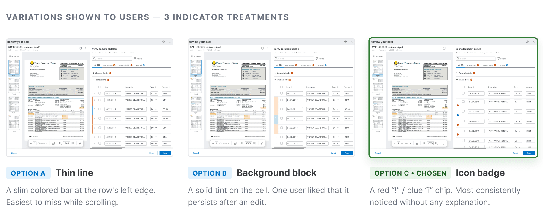
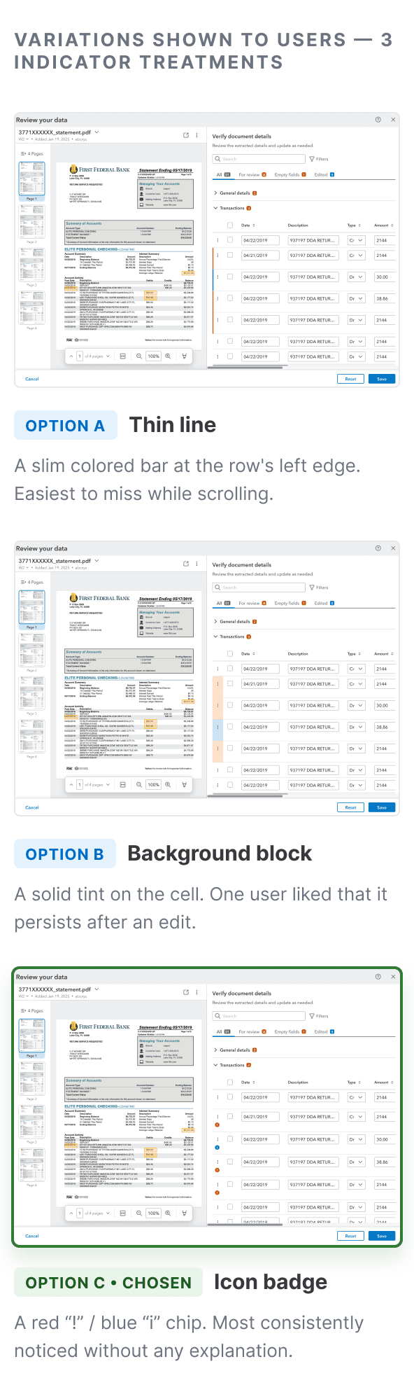


Option C (icon badge) was most consistently noticed — it read as "needs review" without any explanation.
Thin line indicators (A) were easiest to miss while scrolling; several asked for a bolder treatment, up to highlighting the full row.
One participant preferred Option B because it persisted after editing — a low‑confidence field kept its red mark even after an edit, so it could be double‑ and triple‑checked.
The blue "edited" state was generally understood but not universally obvious without a legend; some couldn't distinguish red from orange.
Unprompted: participants wanted the left (PDF) and right (table) panes to scroll in sync, so paging through the statement doesn't require manually re‑aligning both sides.
Study 2: Row‑level actions — add, delete, undo / redo
Tested how accountants add a missed transaction, delete an incorrect one, and undo / redo those changes — using a per‑row overflow ("…") menu plus a global undo control.


7 of 8 found "undo" easily once they knew where to look, but 3 of 4 who found it tucked in the footer said it would be easier closer to the action itself.
5 of 8 initially struggled to find "add row" inside the overflow menu — most expected a visible "+" button. Once shown, everyone completed it easily on later attempts.
7 of 8 found "delete" via the overflow menu easy, describing it as a familiar "more actions" pattern from spreadsheets.
Study 3: Cross‑panel comparison & information architecture
Tested how well a split‑pane layout (source PDF left, extracted transactions right) supports review — plus highlight styling (full row vs. single cell), tabs vs. pills, filtering, panel resizing, and switching between documents.


All 10 participants rated the overall flow easy to very easy; accountants found it more intuitive than SMB users.
Highlight preference split by user type: SMBs (5/5) preferred highlighting the full row; accountants (4/5) preferred highlighting only the specific problem cell — precision vs. a broader visual cue.
8 of 9 clicked the first highlighted field directly on the source document before ever touching a review link or tab — the inline highlight, not a summary tab, is what people acted on first.
Slight preference for tabs over pills (5 vs. 4, 1 no preference) — tabs read as more organized; pills read as more consistent with existing QuickBooks patterns for a couple of participants.
The filter icon wasn't immediately recognizable to 2 participants, and one wanted to see which filter rule was currently applied after applying it.
From three studies to durable principles
Each study produced a decision for this project — but the underlying reasoning generalizes. These are the adaptations worth applying to the next dense, verification‑heavy interface.


The shipped experience, screen by screen
Upload → review → verify & correct → filter → select → import to QuickBooks. Each screen below pairs the source statement (left) with the editable extraction (right), and calls out what the user is doing, what the system is doing, and — right beside the screen — the design rationale: the option space behind each choice and why this one was right.

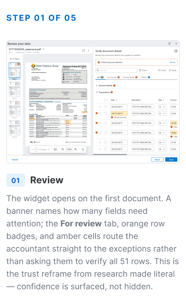


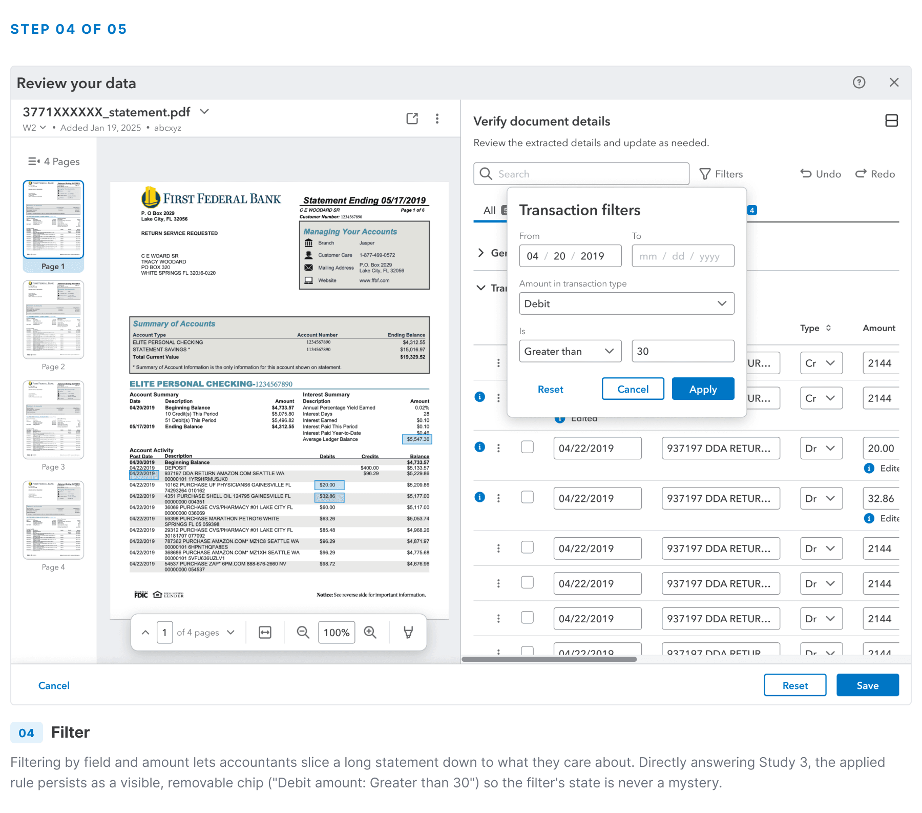


The two moments that best show the interaction thinking: the flagged‑field routing on the review screen (Screen 01), which turns "verify everything" into "correct the exceptions," and the persistent filter chip (Screen 04), which turns an invisible system state into something the user can see and trust. Both trace straight back to the research reframe — trust is earned by proof, not motion.
What made the cut for day one — and what waited
The per‑screen rationale above covers how each surface works. This is the layer above that: with a fixed timeline and a trust‑first bar, what earned a place in the first release versus what was deliberately deferred.


The invisible labor of keeping the UI simple
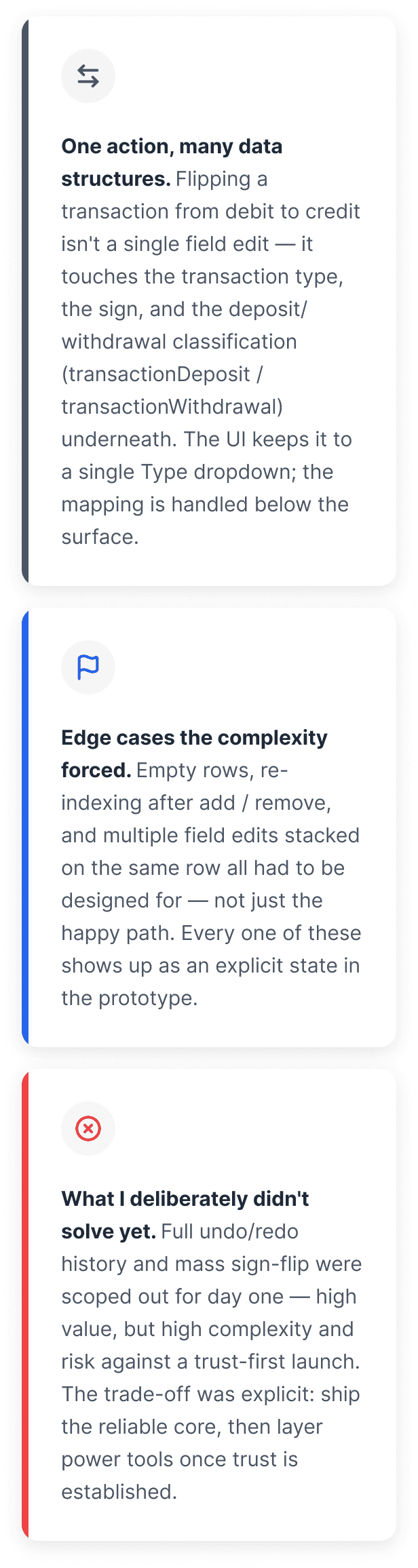
Some of the hardest design work here was absorbing backend complexity so the user never sees it.

Closing the loop on the problem
The per‑screen rationale above covers how each surface works. This is the layer above that: with a fixed timeline and a trust‑first bar, what earned a place in the first release versus what was deliberately deferred.


What the project taught me
The judgment call I'd defend: making accuracy — not feature breadth — the day‑one north star, and building the whole review surface around routing users to the exceptions. In a market where customers already had a near‑100% trusted alternative, breadth without trust would have shipped a product no one adopted.
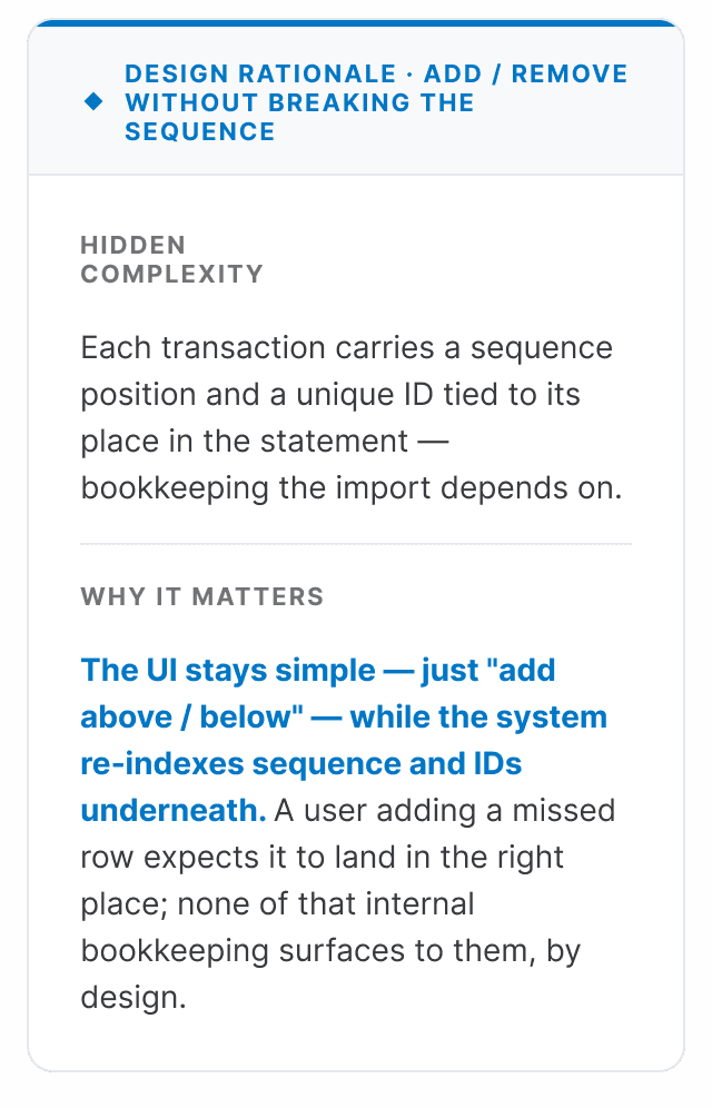
What this taught me about legacy data models: the best design work was often invisible — collapsing a debit/credit flip that touches several underlying structures into one dropdown, re‑indexing sequence and IDs behind an "add row." Designing on top of a complex schema is largely the discipline of deciding what not to surface.
What I'd do differently: validate the confidence‑signal treatment even earlier — it was the assumption most load‑bearing for trust, and the one that changed most between early and shipped versions. And I'd bring engineering into the highlighting debate sooner, since cell‑precise highlighting had real implementation cost that shaped the final compromise.
How it changed my approach: I now start ambiguous, technically‑constrained problems by naming the leap‑of‑faith assumptions explicitly and designing the smallest studies that can falsify them — before touching a single screen.