Alert Violation Timeline: Reimagining alert violation events
Project Timeline: 3 Months
My Role
Team
Project Brief
Impact:
Reduced user's issue prioritisation time by 70% -> Drastically decreasing MTTR (Mean Time To Resolution)
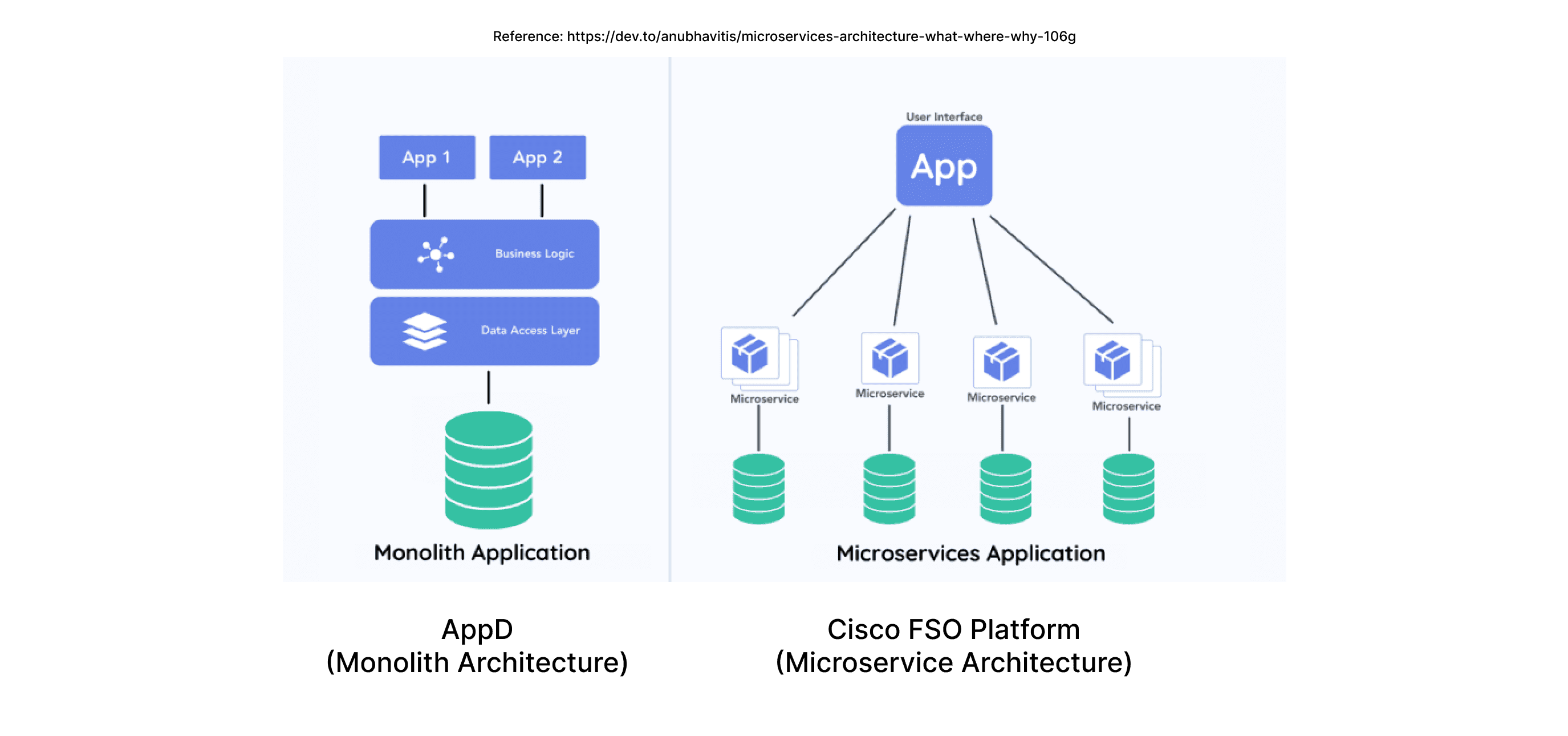
Cisco AppDynamics was a leading product in the APM market. However, with the growing demand for Full-Stack Observability (FSO) platforms and recognizing the opportunities with new customers, we decided to build our own FSO platform.
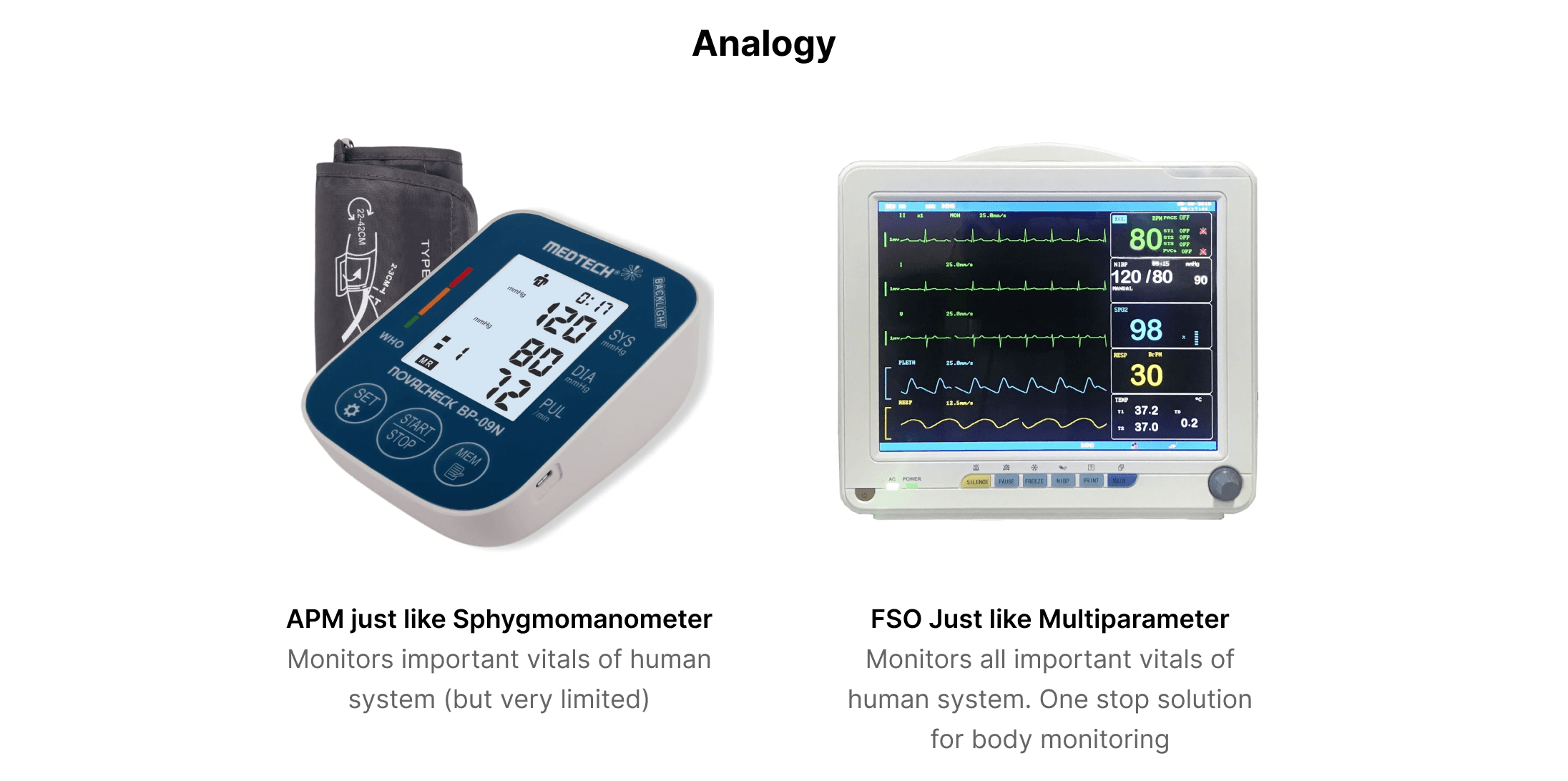
AppDynamics was originally based on an older architecture, so a new platform needed to be built from scratch rather than on the existing system. While different teams worked on various sections of the platform, my team and I were part of the Alerting and Actioning crew.
We were responsible for the monitoring aspect of the FSO platform, covering everything from Health rule creation to the consumption of event data and violations in the system. Although we successfully built the 'Health rule' flows, there was still uncertainty about how events and violation data would be displayed in the system.
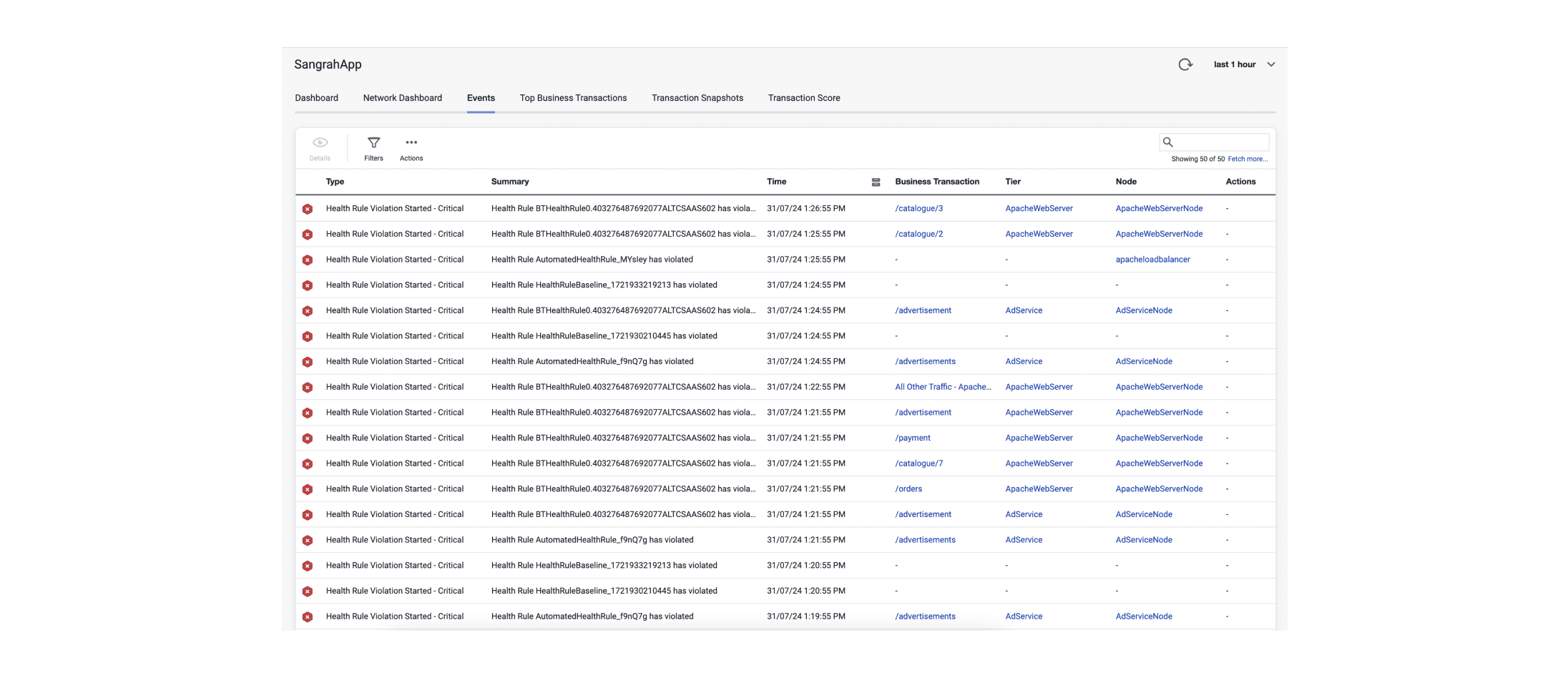
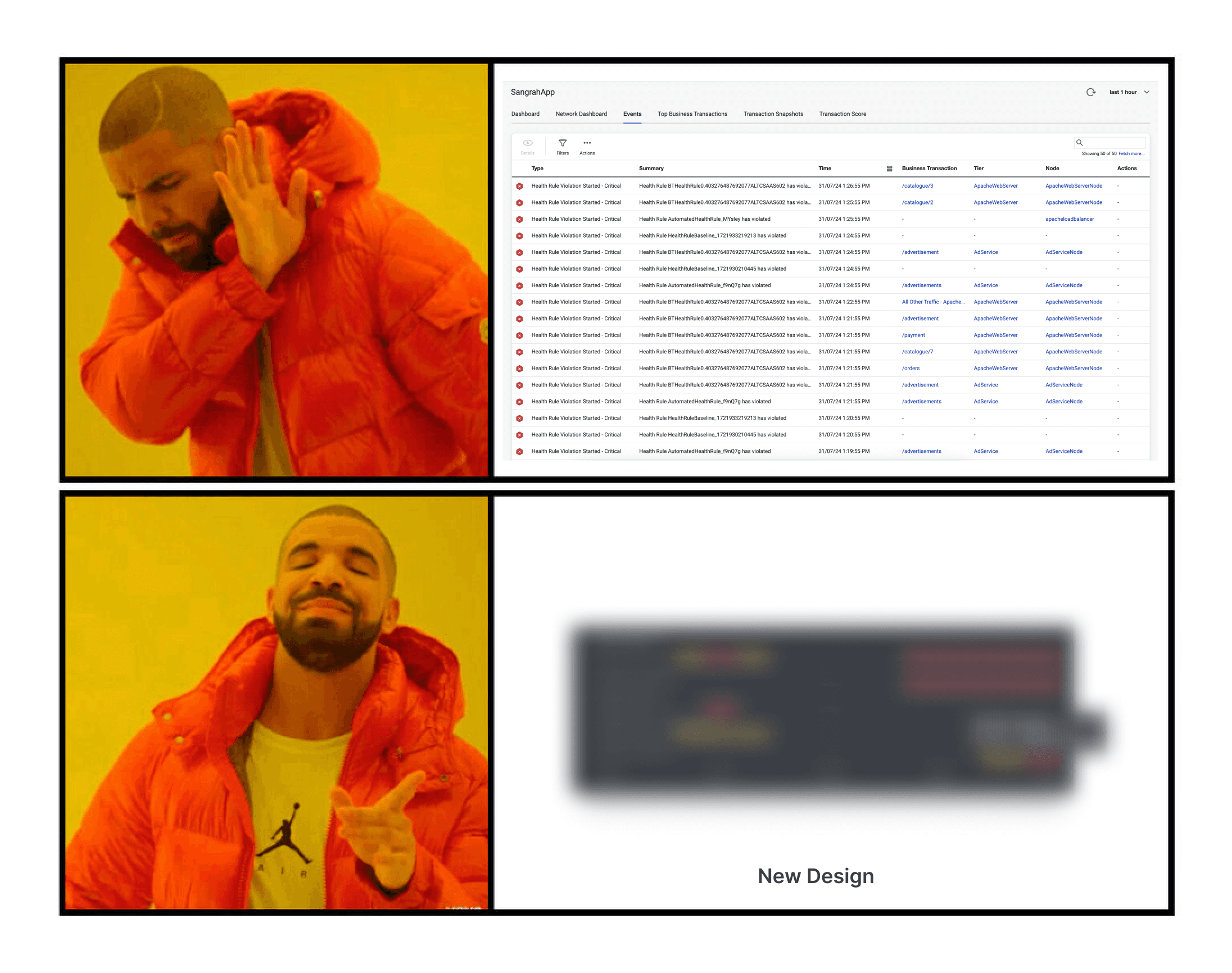
In the legacy AppDynamics product, these events were displayed as a simple list on a single page
It was time-consuming for users to understand and prioritize the violations, which impacted the Mean Time to Resolution (MTTR), a key success metric for APM and FSO tools.
To address how users consume these events and minimize the time needed for troubleshooting, we initiated this project.
User Persona
The users we are going to cater for this are DevOps Engineers.
DevOps: A DevOps engineer is an IT generalist who should have a wide-ranging knowledge of both development and operations, including coding, infrastructure management, system administration, and DevOps toolchains. DevOps engineers should also possess interpersonal skills since they work across company silos to create a more collaborative environment.
DevOps in a general sense:
Creates Health rules
Monitors entities
Initiates troubleshooting journey when something goes south
Discovery
Internal Product Understanding
Started with understanding how the system works in AppDynamics.
The project scope was confined to the generation of violation events and the user actions right before troubleshooting.
Competitive analysis
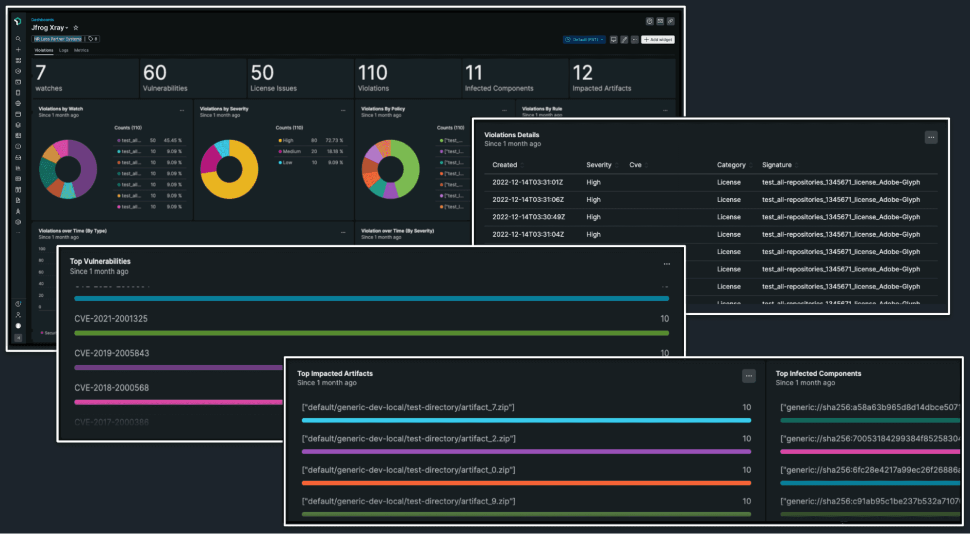
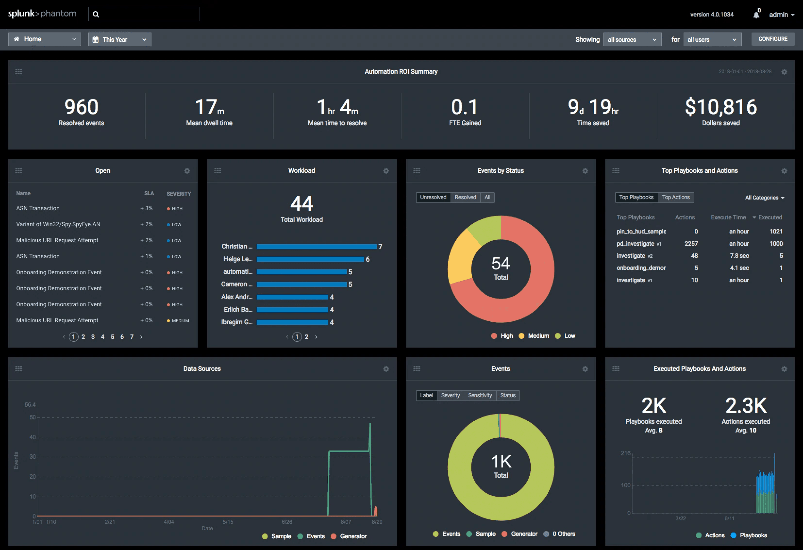
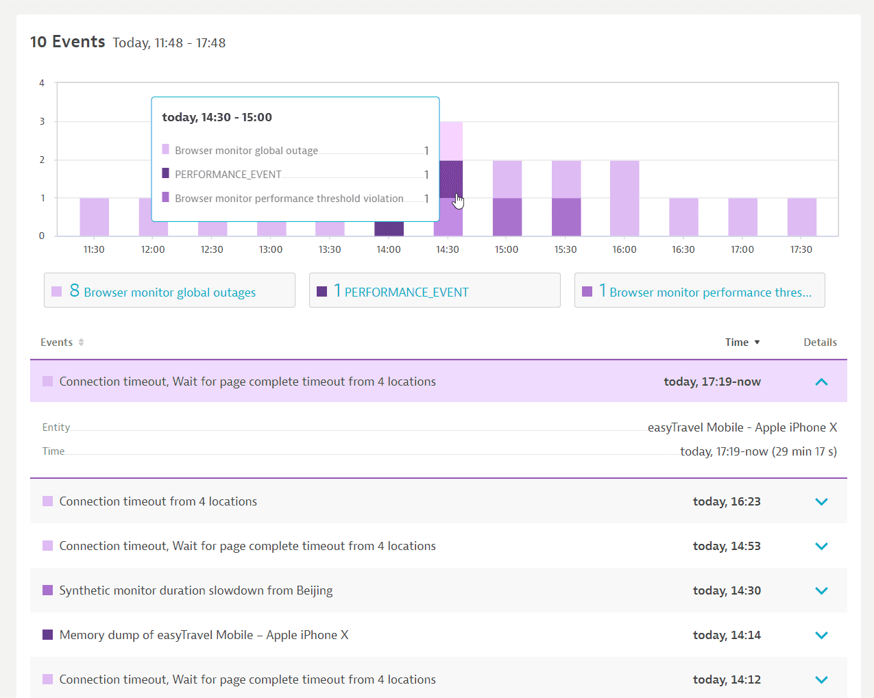
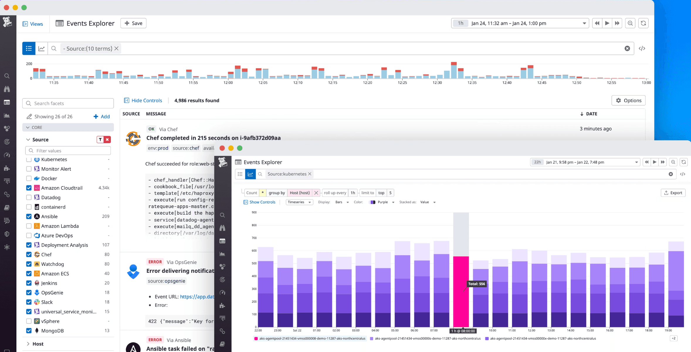
To begin, we investigated whether this was a common problem and if there were any general industry trends addressing it.
We studied four major competitors:
Splunk
New Relic
DataDog
Dynatrace
Key Insights:
Dashboards with pie charts were commonly used to visualize events.
There were contextual event lists for specific scenarios.
There was no general trend; visualization approaches varied based on the platform's data modeling.
Different entry points existed, but users could eventually access detailed information on demand
Ideation
There were two key decisions we needed to make:
What information to show.
Where to display this information.
Where to show
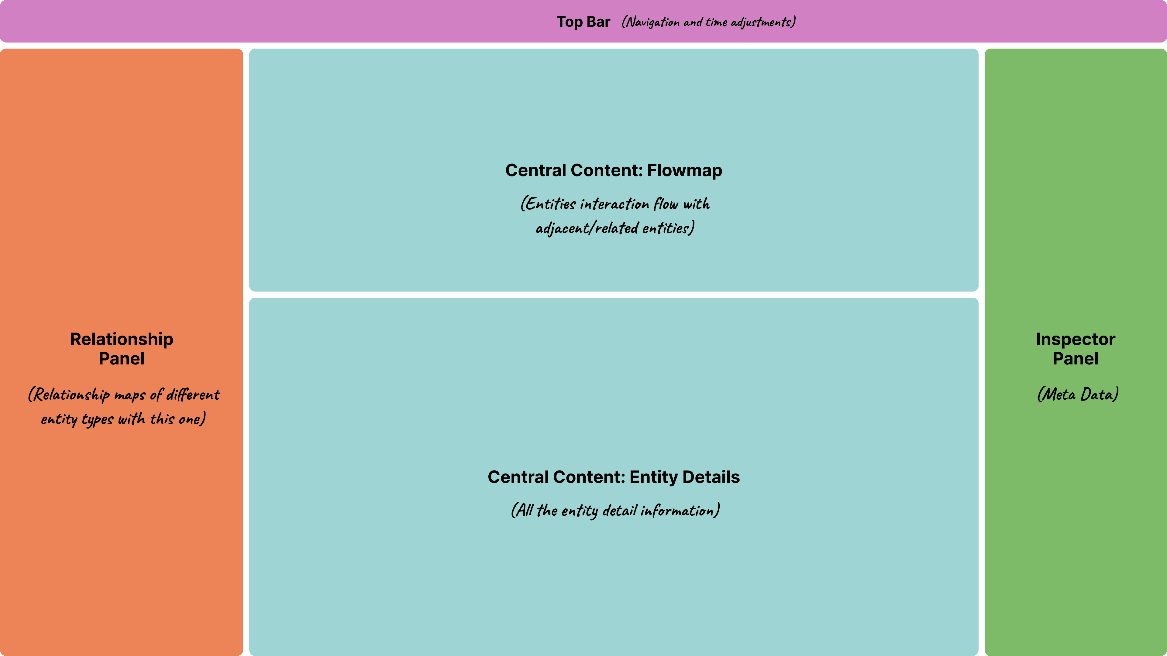
We began by deciding where to display the violating events, as this was a relatively simpler problem. CISCO FSO used an 'Entity model,' and violations were relevant to specific entities. The best contextual place to show this information was the 'Entity Centric Page (ECP),' or in general terms, the 'Entity Detail Page.' This page would contain all the information related to that particular entity.
ECP page layout breakdown:
Top Bar
Relationship bar
Inspector panel: Meta data
Central content area
Flowmap
Entity Data
2 Areas where event information made sense were:
Central content areas
Inspector panel
Sketched some ideas around how information can be added in these sections.
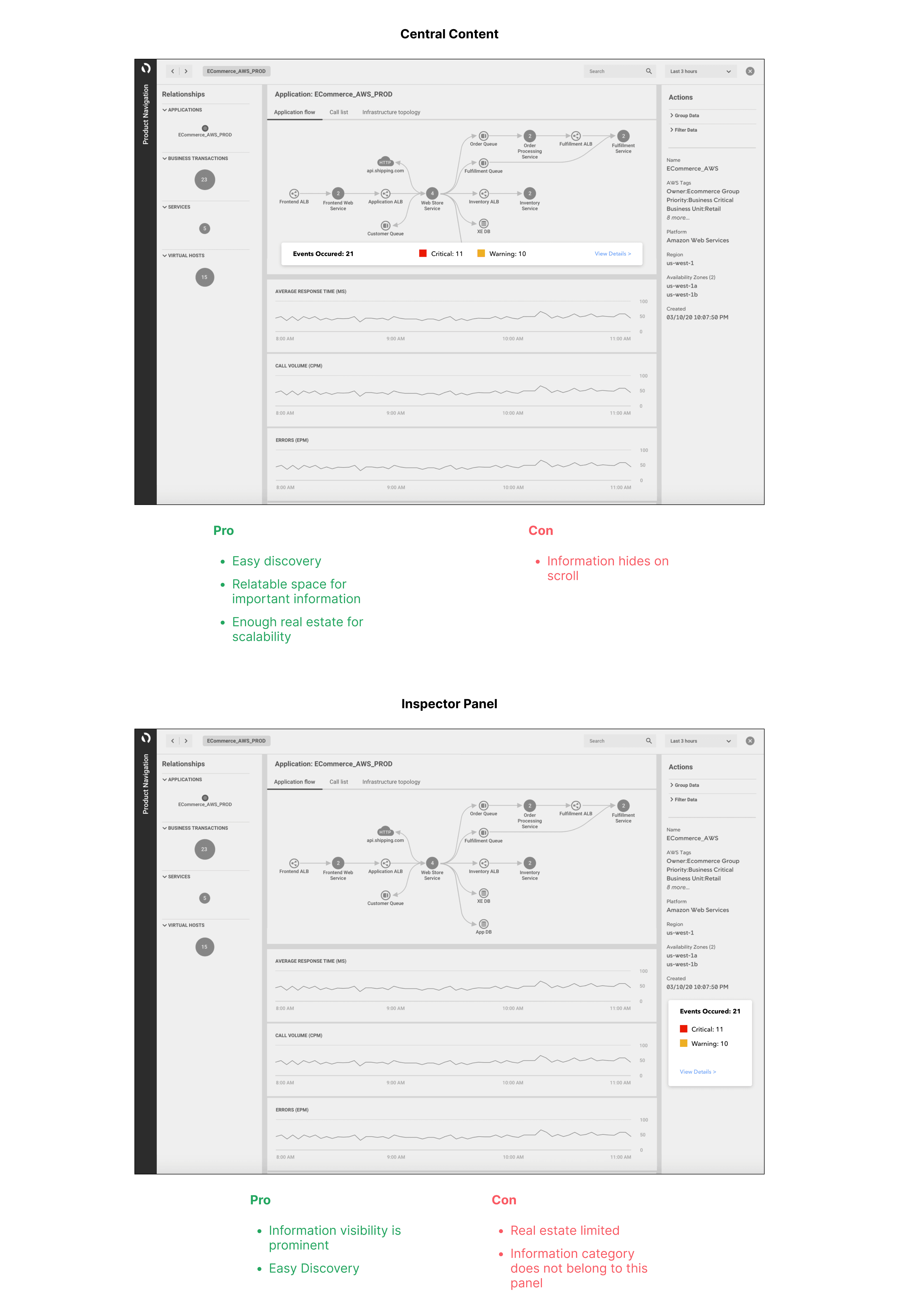
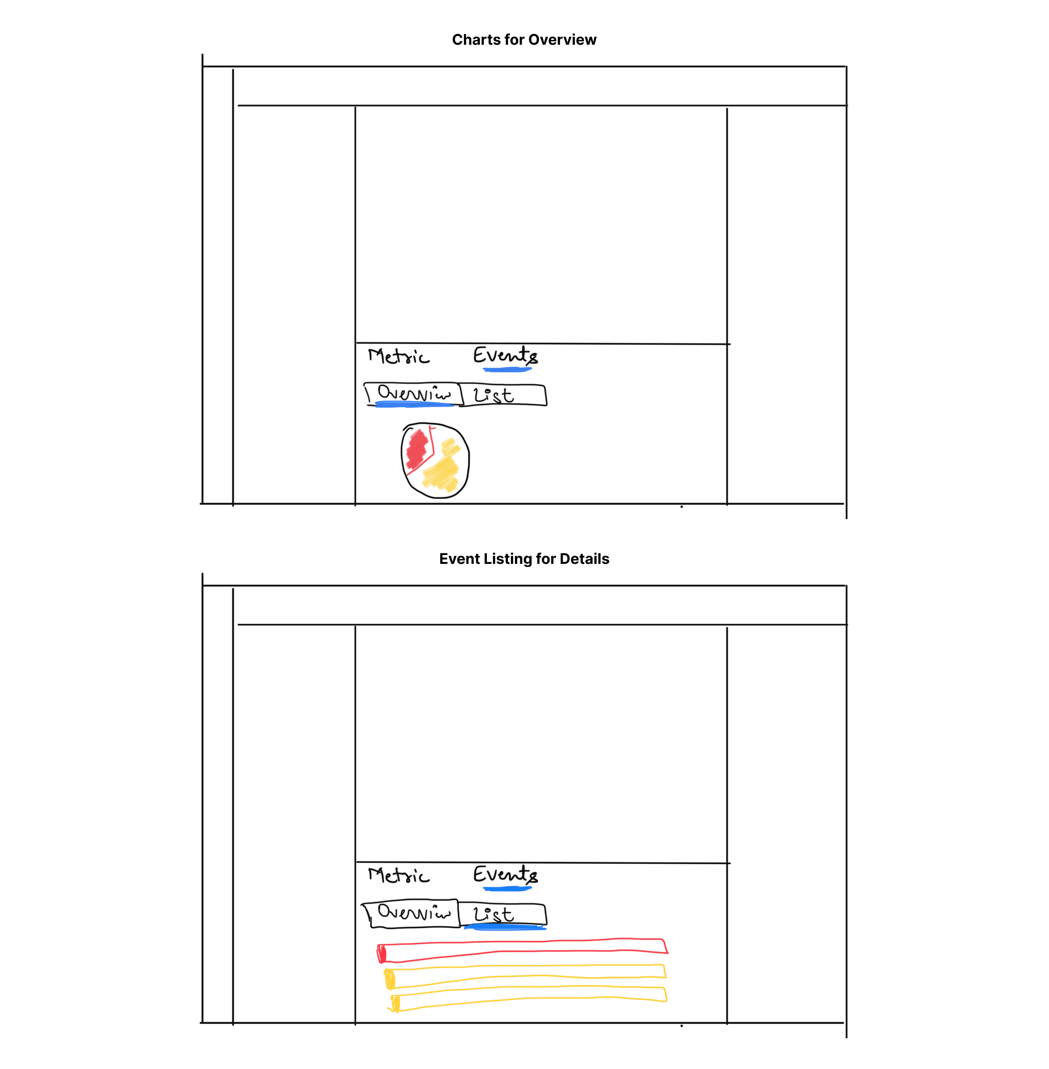
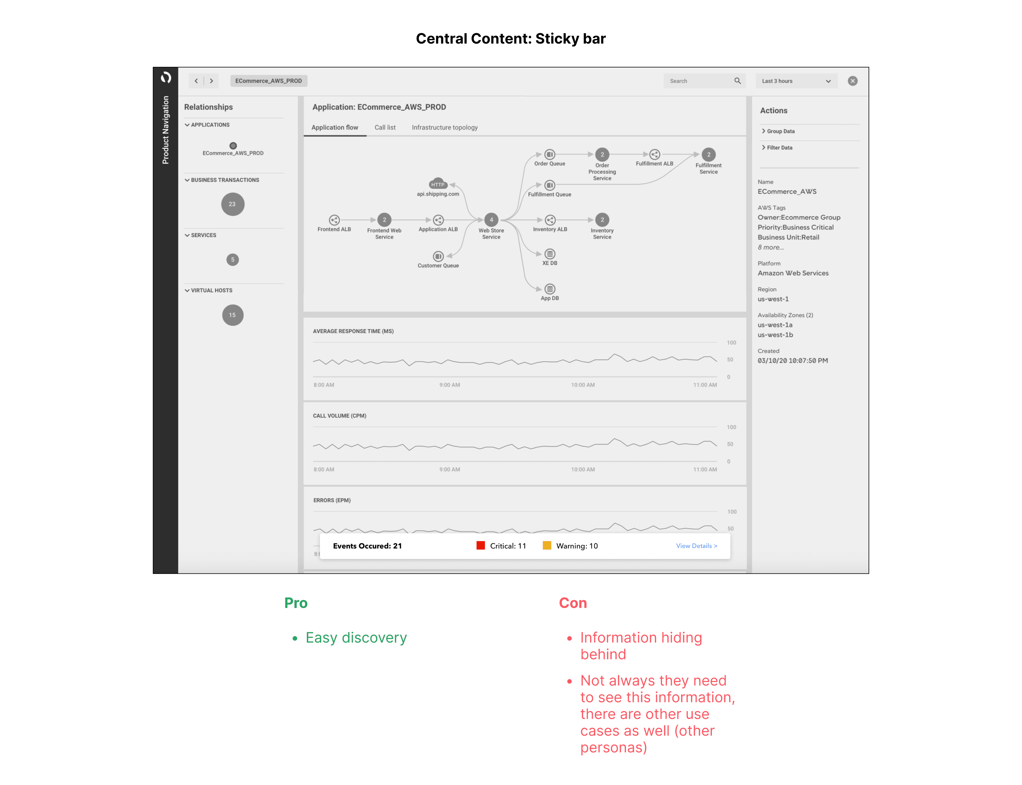
We decided to use the Central area for displaying the information and explored ways to ensure that the details would not be hidden when users scroll.
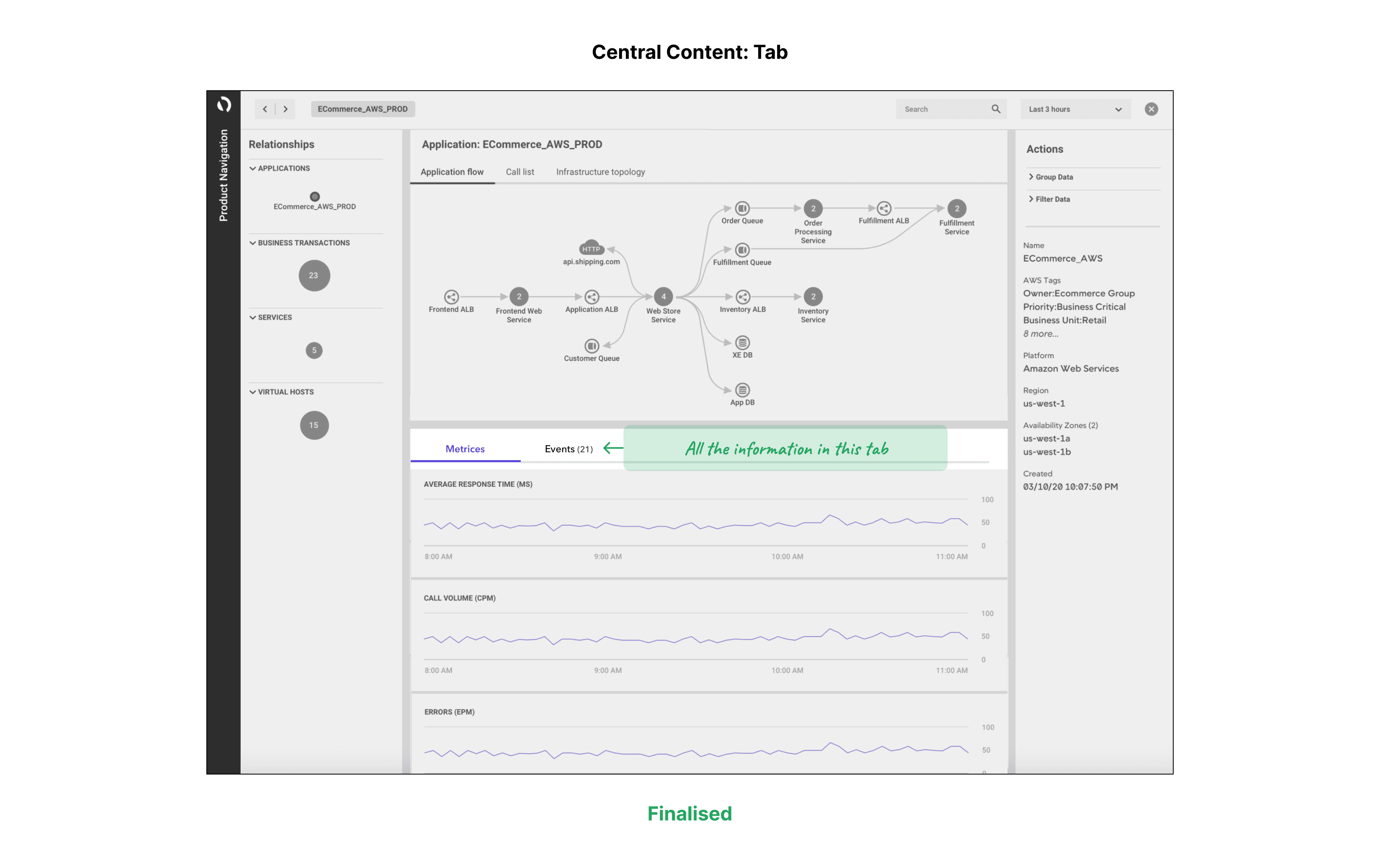
We also explored the idea of splitting the data and presenting it as a 'tab.' This approach:
Balanced the page visualization.
Provided a familiar interaction consistent with the legacy AppDynamics product.
What to show
We began by examining how competitors display information, such as using dashboards, pie charts, and graphs. These visuals would help users understand the overall system.
We then added a feature to view a list of events, which aids in decision-making and prioritization for troubleshooting by providing relevant meta information
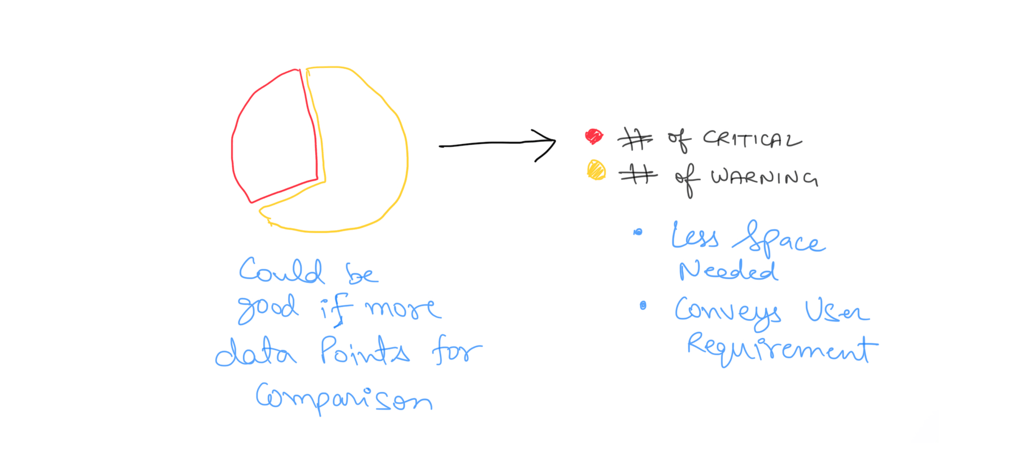
We decided against using pie charts due to the limited variety of data types:
Critical events
Warning events
Also, there was no comparison needed between the data. Users focuses on the number of Reds, and Yellows instead of comparison. Thus, this information could be displayed more concisely.
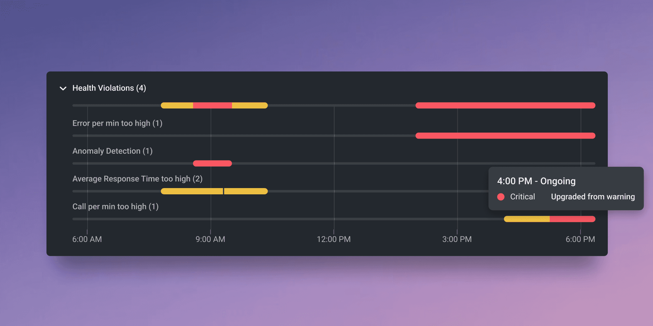
After discussions with the PM, we realised that many events were part of a single violation. Users for their initial approach towards violations do not want to see related events separately. It would be much more optimised if they are combined together.
To address this, we combined the events and introduced a timeline format to make the information visually clear and understandable
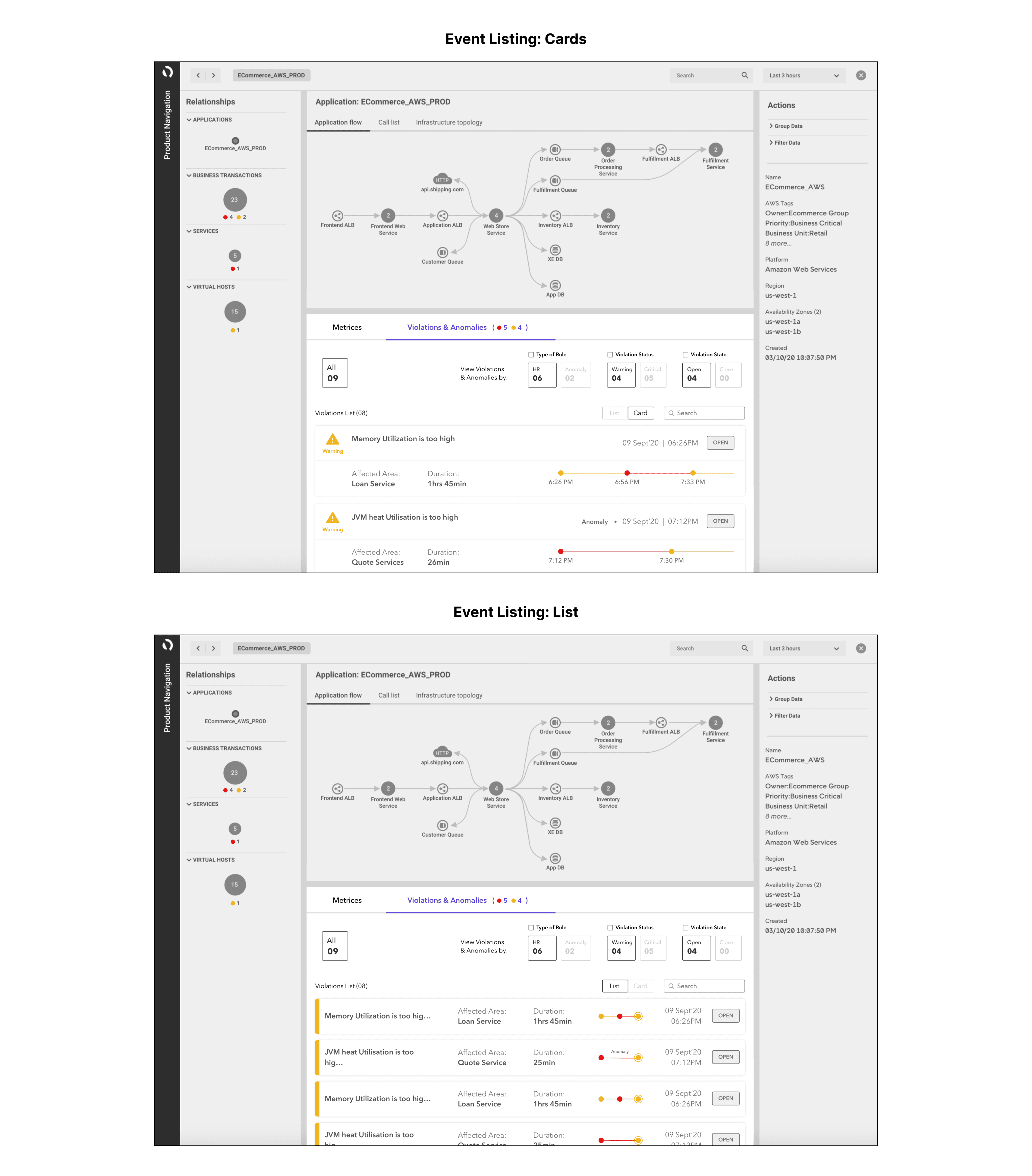
This proposal:
Gives overall idea of the system
Help user prioritize the violation using meta data
User Testing
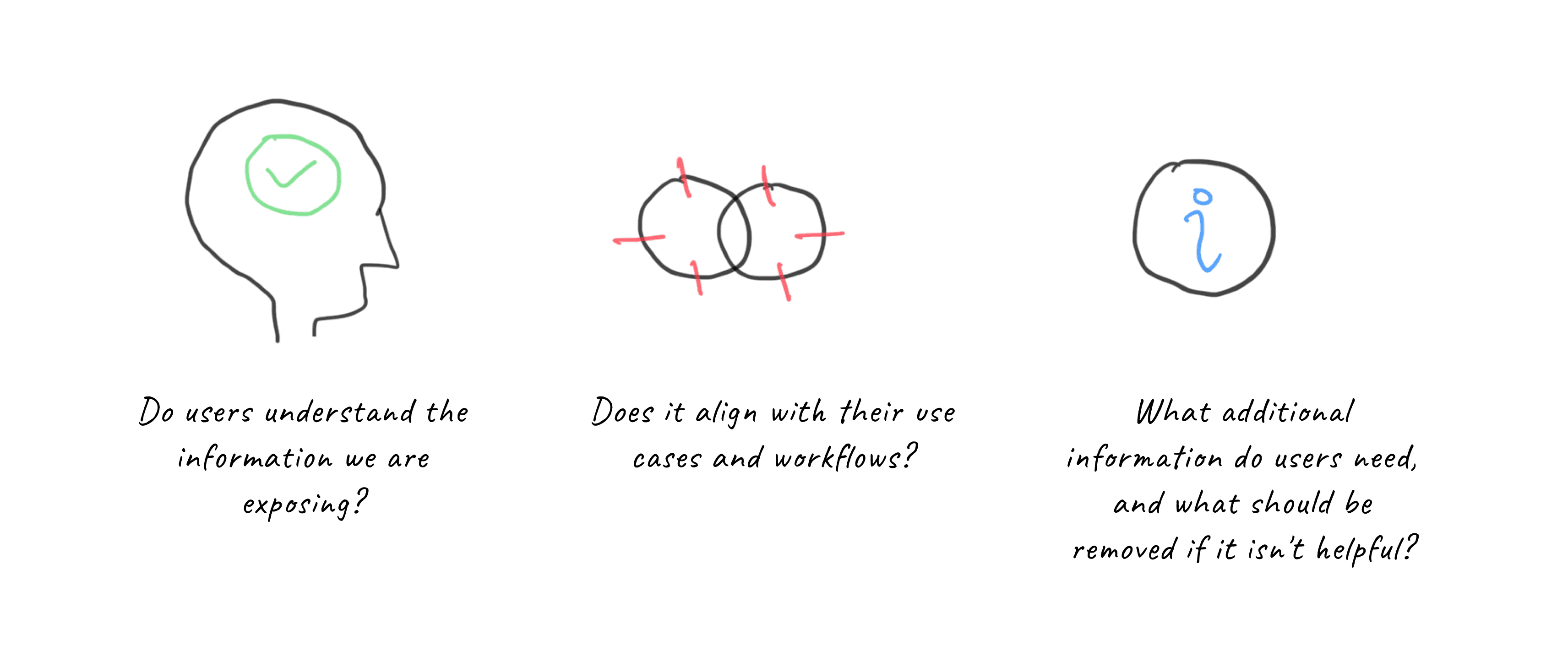
We took the flows to the users and tested for the following questions:
Key Insights:
The Violations & Anomalies page is not seen as the sole entry point for troubleshooting in users' current workflows. Instead, it is one of many entry points.
Some users find value in the Violations & Anomalies page because it offers a comprehensive overview of issues related to specific applications, which are affected by problems reported in alerts.
The page could become a more useful troubleshooting entry point if it integrates smoothly into users' existing workflows and reduces their time spent on troubleshooting, problem isolation, and diagnosis.
The Violations & Anomalies page can complement other features, such as flow maps, Transaction Snapshots, and Errors.
Other Observations:


Key Design Decisions:
Optimize Violation List: Improve space utilization to make the list more compact.
Enhance Visualization: Use visual elements to make information scanning easier.
Prioritize Information: Display information on demand rather than showing everything at once.
Integrate with Other ECP Information: Relate violations to other relevant information on the Entity Centric Page (ECP), such as flow maps.
Design Interventions
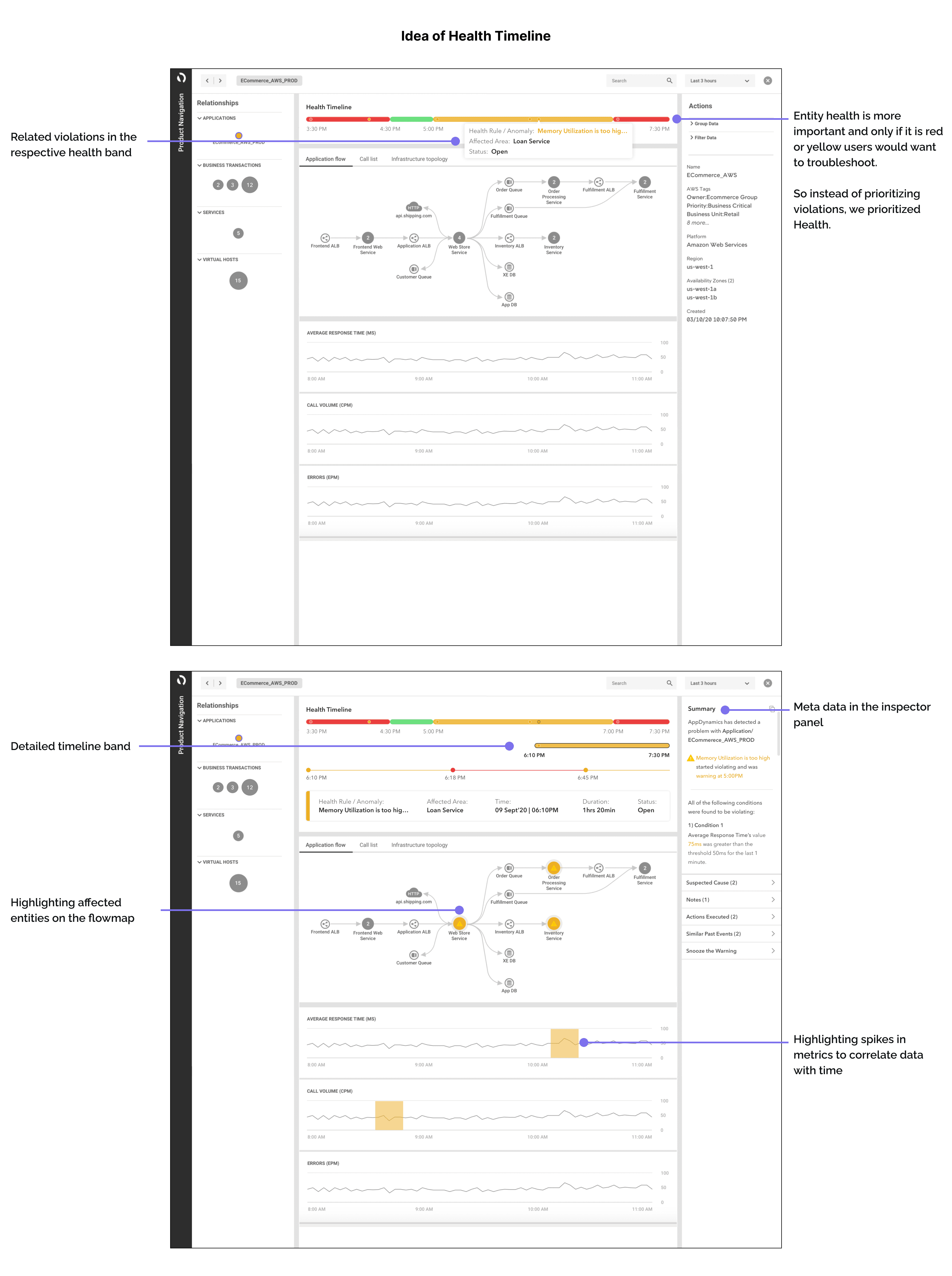
After this iteration, we conducted an internal critique session with cross-domain teams to understand how the ECP layout fits into different user flows. We identified five major concerns:
Following the initial idea and critique session, we iterated to refine the flow and enhance interactions:
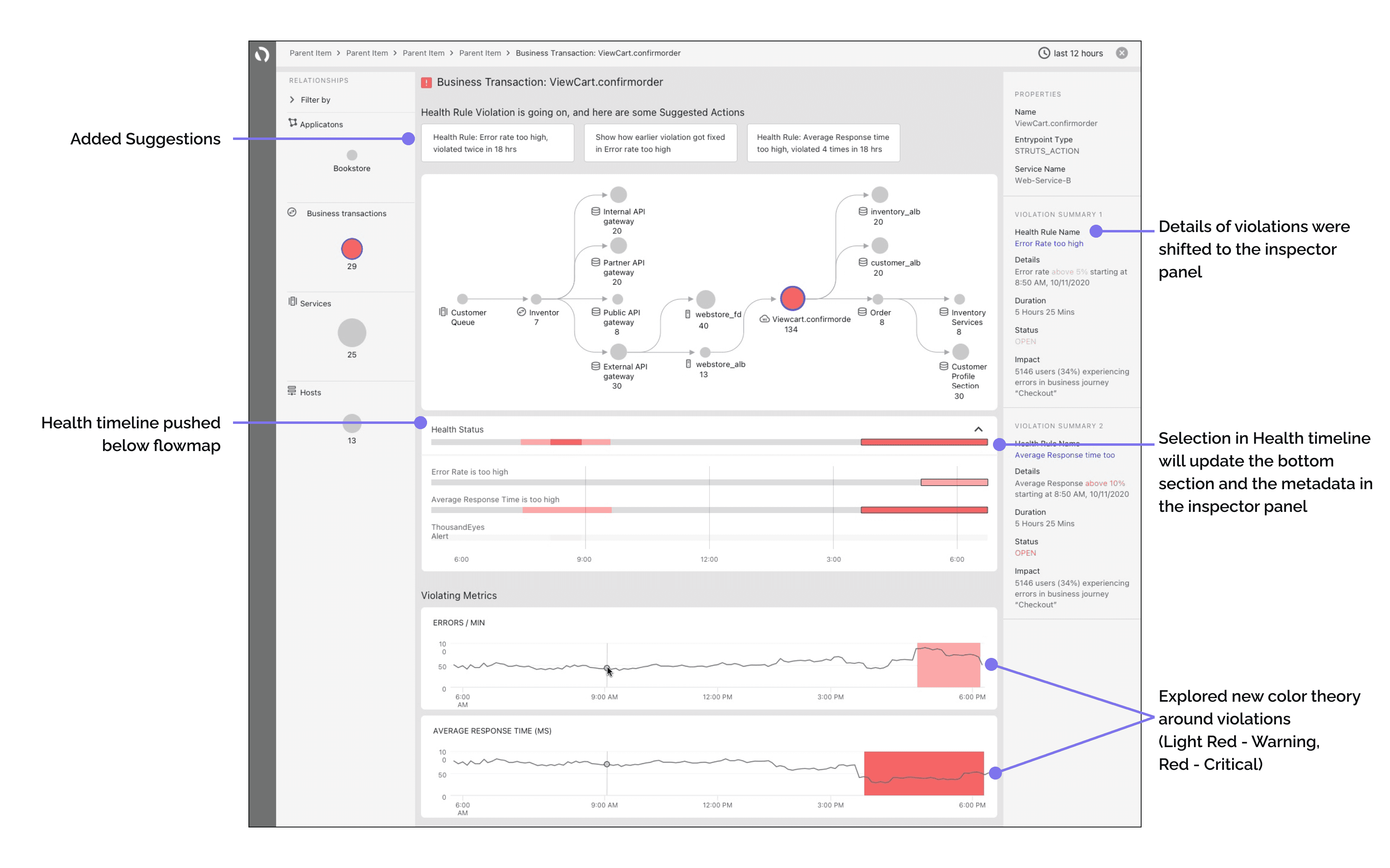
Health Timeline Placement: Moved the health timeline below the Interaction Flow Map to focus on data correlation.
Dynamic Updates: Selection in the health timeline updates the bottom section and metadata in the inspector panel.
Space Optimization: Shifted violation details to the inspector panel to minimize space consumption in the central area.
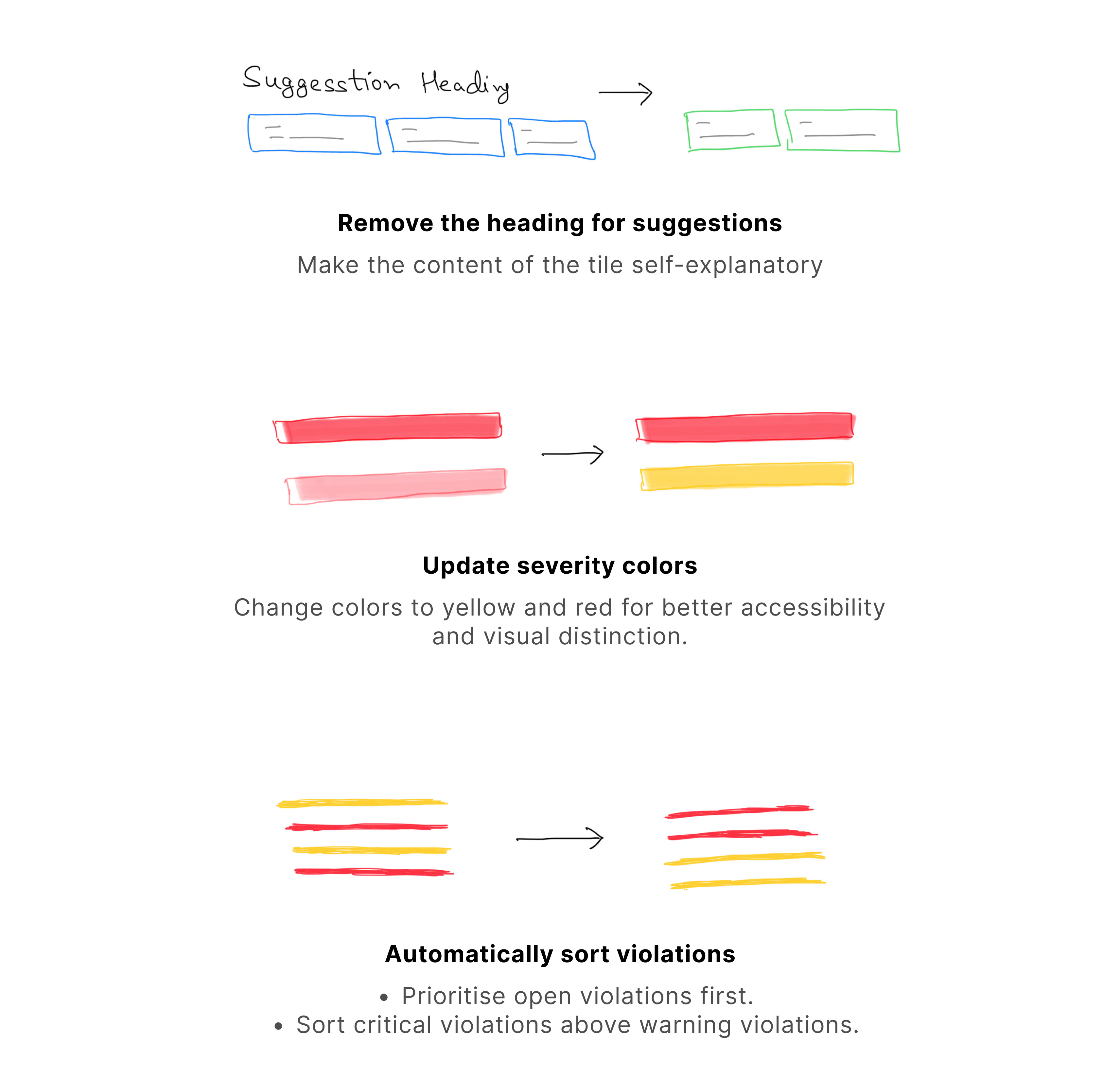
Suggestions Section: Added a section at the top of the page for next-step suggestions.
Color Theory Exploration: Tested new color schemes for violations to better understand user interpretation.
User Testing 2
Given that this was a completely new concept, we conducted another round of user research covering all possible violation use cases.
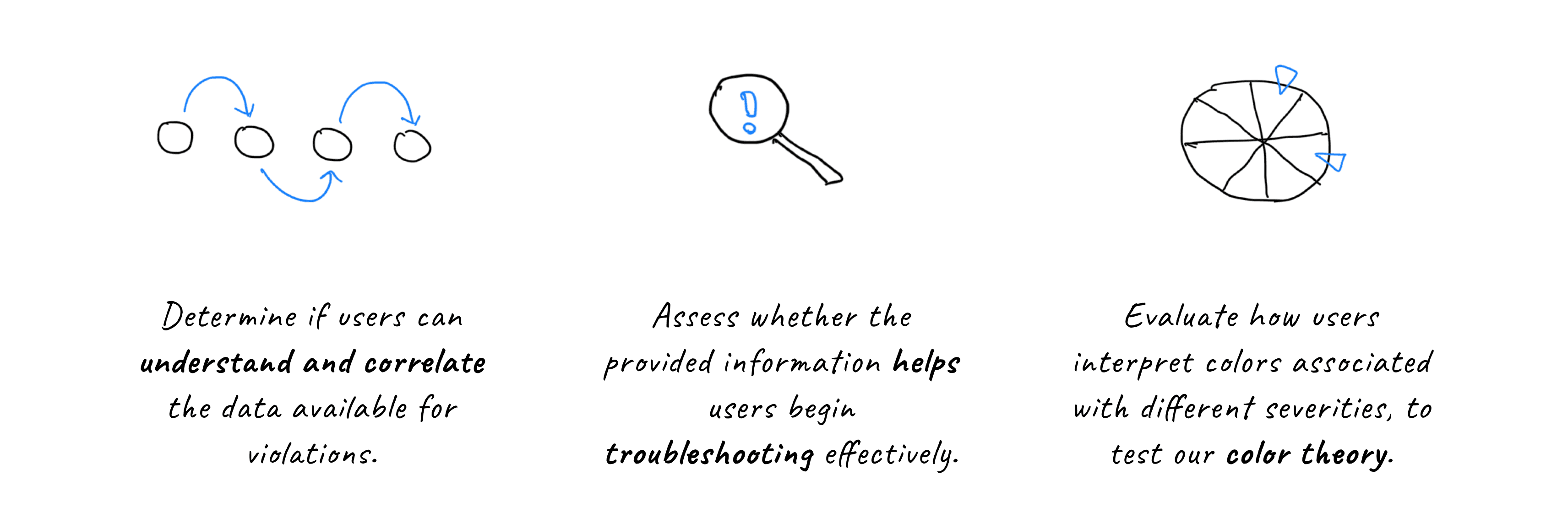
The main objectives of the user testing were to:
Key Insights:
Overall, participants provided positive feedback on the new design prototype’s capabilities.
Efficiency Improvement: 5 out of 6 participants believed the new features would help them troubleshoot more efficiently and reduce MTTR because:
All relevant information is on the same screen, aiding comparison and correlation.
The prototype’s workflows reduce the number of clicks and pages needed for troubleshooting.
User-Friendly Features: 2 participants noted that the addition of next-step suggestion cards would make it easier for new or less experienced users to get started.
Additional Capabilities Needed: Some participants requested more features to help prioritize issues and improve troubleshooting workflows, including:
Sorting and filtering issues.
Understanding suspected causes detected by Anomaly Detection.
Color Concerns: The new color scheme for health statuses negatively impacted some participants’ perception of the prototype's ease of use.
Other Observations:


Key Design Decisions:
Important Product Decisions:
Due to technical constraints, the 'impact' feature previously included in the inspector panel will not be implemented.
Final design and visual refinement

Speccing
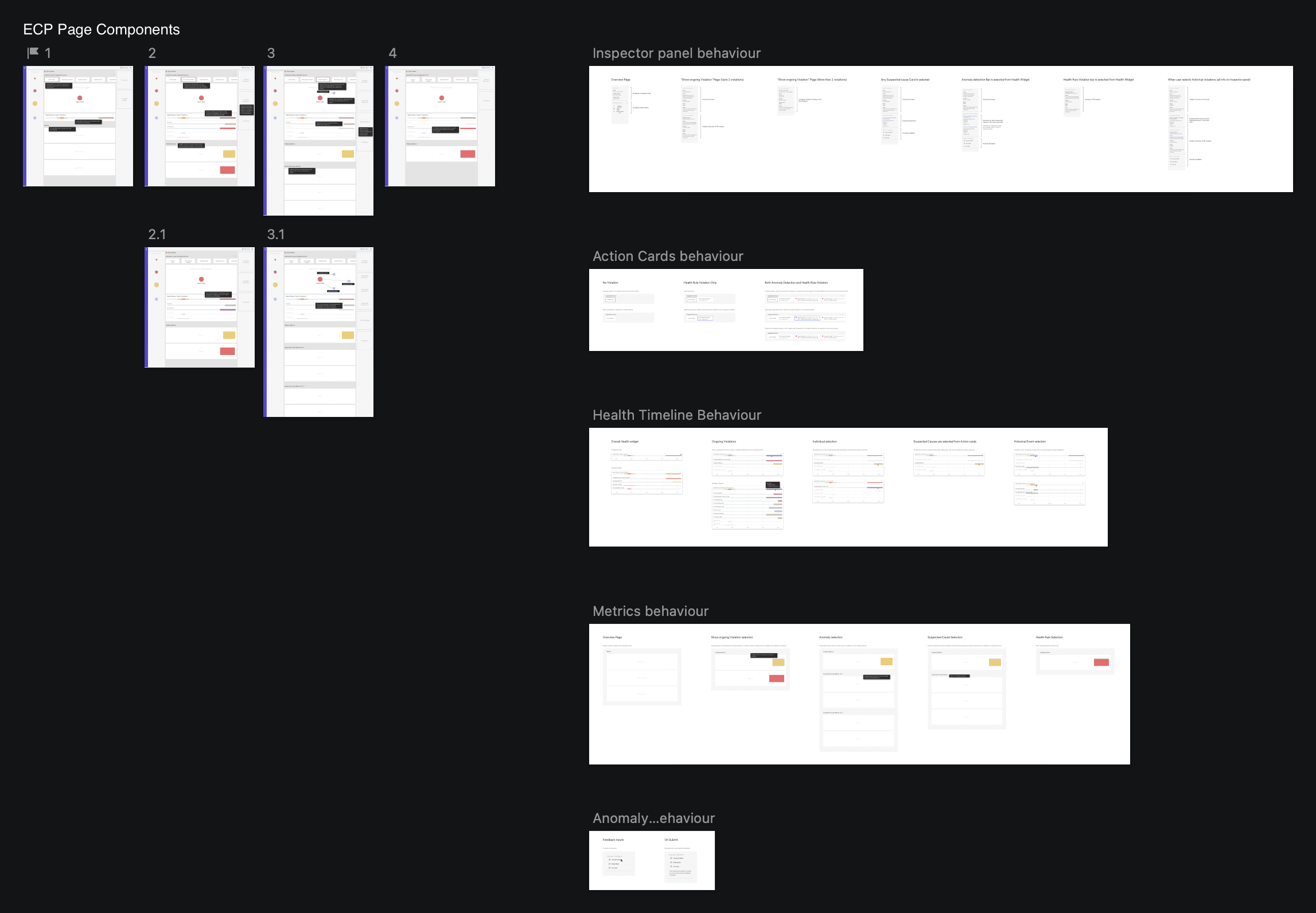
What began as a simple alerting project evolved into a major interface and experience update for Cisco FSO. To capture the details and provide a template for other teams, we created specifications for this flow.
We included all relevant use cases and scenarios, creating a comprehensive solution for the ECP page template
Key Learnings
Stakeholder Alignment:
Aligning PMs, developers, and other stakeholders is crucial for creating the best user experience, especially for new features.
Critique sessions and collaboration within team at right time helps understand the overall system and not just the scoped problem statement.
Early User Research and Testing:
Conducting user research and testing early in the project ensures that the design meets user needs and expectations.
Reduces the risk of re-work in important projects.
Exceeding Initial Expectations:
Don’t limit yourself to the initial problem statement; look for opportunities to go beyond and exceed user expectations.
