Alert Explorer: One stop solution for alert visibility in Cisco Cloud Obervability
Project Timeline: 2 Months

My Role
Team
Project Brief
Impact:
Reduced Alert diagnosis time by 90% -> Drastically decreasing MTTR (Mean Time To Resolution)
Background
Cisco offers a Full Stack Observability Platform that helps users understand overall system behaviors, even in complex microservice architectures. This enables users to quickly identify the causes of issues based on their effects.
Previously, in Cisco’s Observability platform, users relied on alert notifications or manual monitoring of entities to check for violations (issues) in the system. Most users focus on specific types of entities (system components) that they monitor.
80% customers send alerts to incident management tools just for better visibility.

The time it takes for users to start troubleshooting is quite high, typically around 55 minutes to 1 hour from the moment a violation is detected to the beginning of the troubleshooting. This duration is significant, and reducing it could greatly lower the MTTR (Mean Time To Resolution), a key success metric for observability tools.
So, we decided to build a functionality that
allows users to access all alerts in one place
provide related information,
enabling them to proceed with troubleshooting as needed.
User Persona
The users we are going to cater for this are DevOps Engineers.
DevOps: A DevOps engineer is an IT generalist who should have a wide-ranging knowledge of both development and operations, including coding, infrastructure management, system administration, and DevOps toolchains. DevOps engineers should also possess interpersonal skills since they work across company silos to create a more collaborative environment.
DevOps in a general sense:
Creates Health rules
Monitors entities
Initiates troubleshooting journey when something goes south
Discovery
Discovery Research Analysis
Previously, several discovery research projects were conducted to understand how users troubleshoot using MELT data (Metrics, Events, Logs, Traces), which are considered the pillars of observability.
Another significant user research effort, known as "Unknown Unknowns," focused on identifying and addressing blind spots for users—problems and solutions that were not previously recognized.
These studies were highly relevant to troubleshooting, and since we already had data, it was crucial to understand their findings to guide our next steps.
To do this, I began mapping the findings to opportunity areas and points. This process helped identify actionable insights that could be applied to our specific use case, allowing us to better align our strategies with user needs and potential improvements.
MELT Troubleshooting User Research Analysis
Unknown - Unknowns User Research Analysis

Refined and collated opportunity points based on the user research:
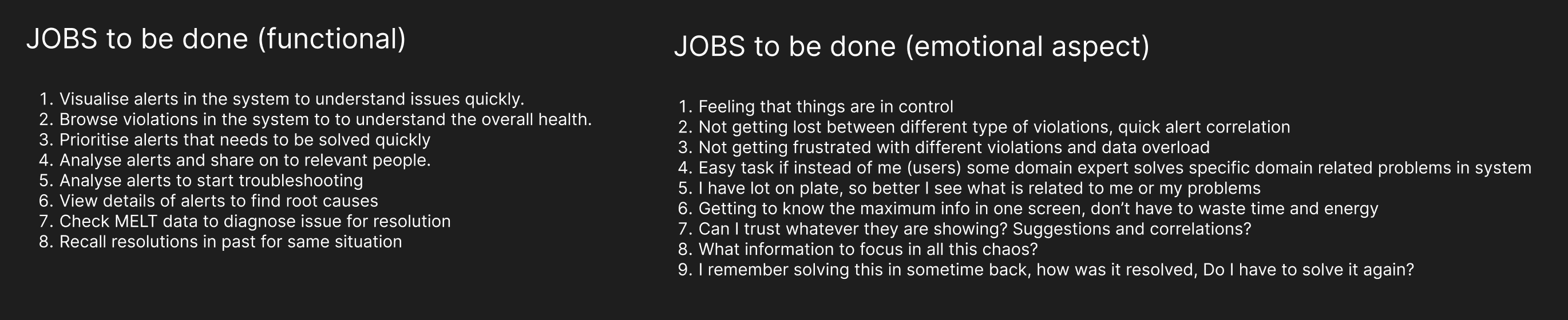
1. Centralised Alert Details:
Provide comprehensive alert details and information in one place.
Include a reminder feature for known issues, showing what actions were taken last time.

2. Content and Clarity in Alert Details:
Focus on providing only limited but highly useful information.
Ensure entry points to related data points like logs and traces are clearly accessible.
Present a concept of confidence rating for the alerts.

3. Efficient Layout and Visualisation:
Create a quick scan layout with a strong focus on timelines and visualisation.
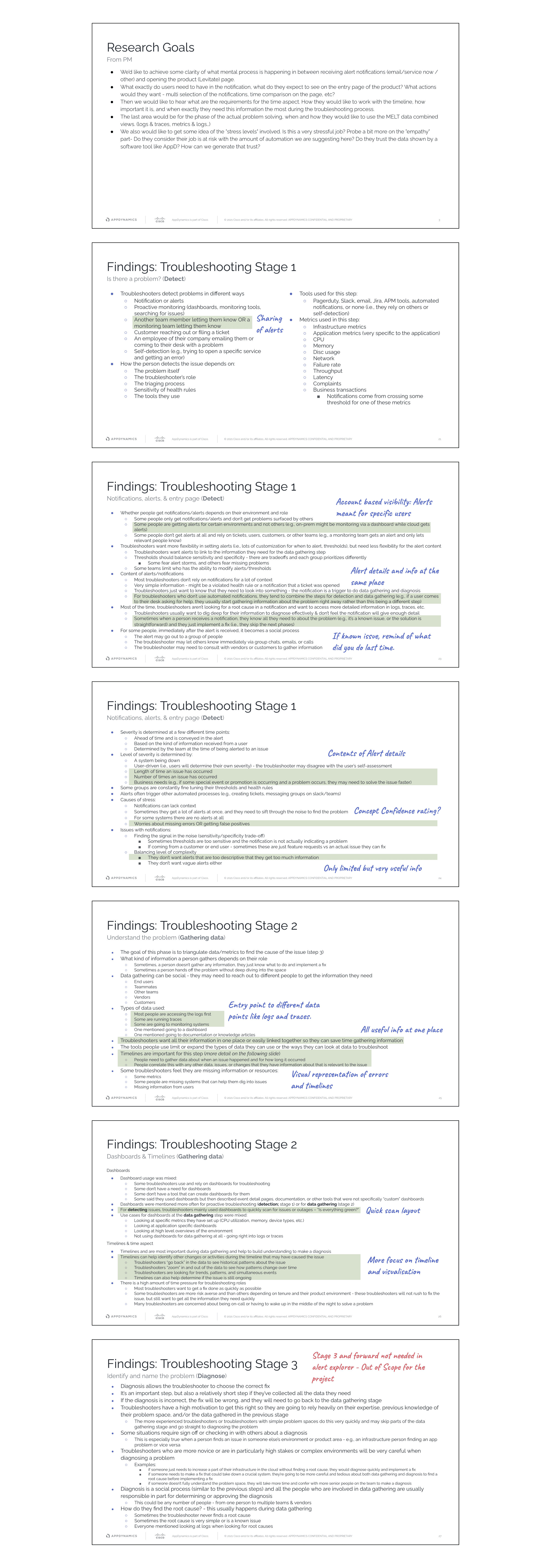
Include visual representations of errors and timelines for a clearer understanding.
Initiate correlation and domain-centric views for better context.
4. Trust Building and Reliability:
Highlight past actions and resolutions, as users find them more reliable.
Use an Alert Explorer as the base for initiating all troubleshooting flows.
5. Prioritisation and System Vitals:
Emphasise the prioritisation of alerts for efficient troubleshooting.
Explore the implementation of system vitals (MELT data) as a starting point.
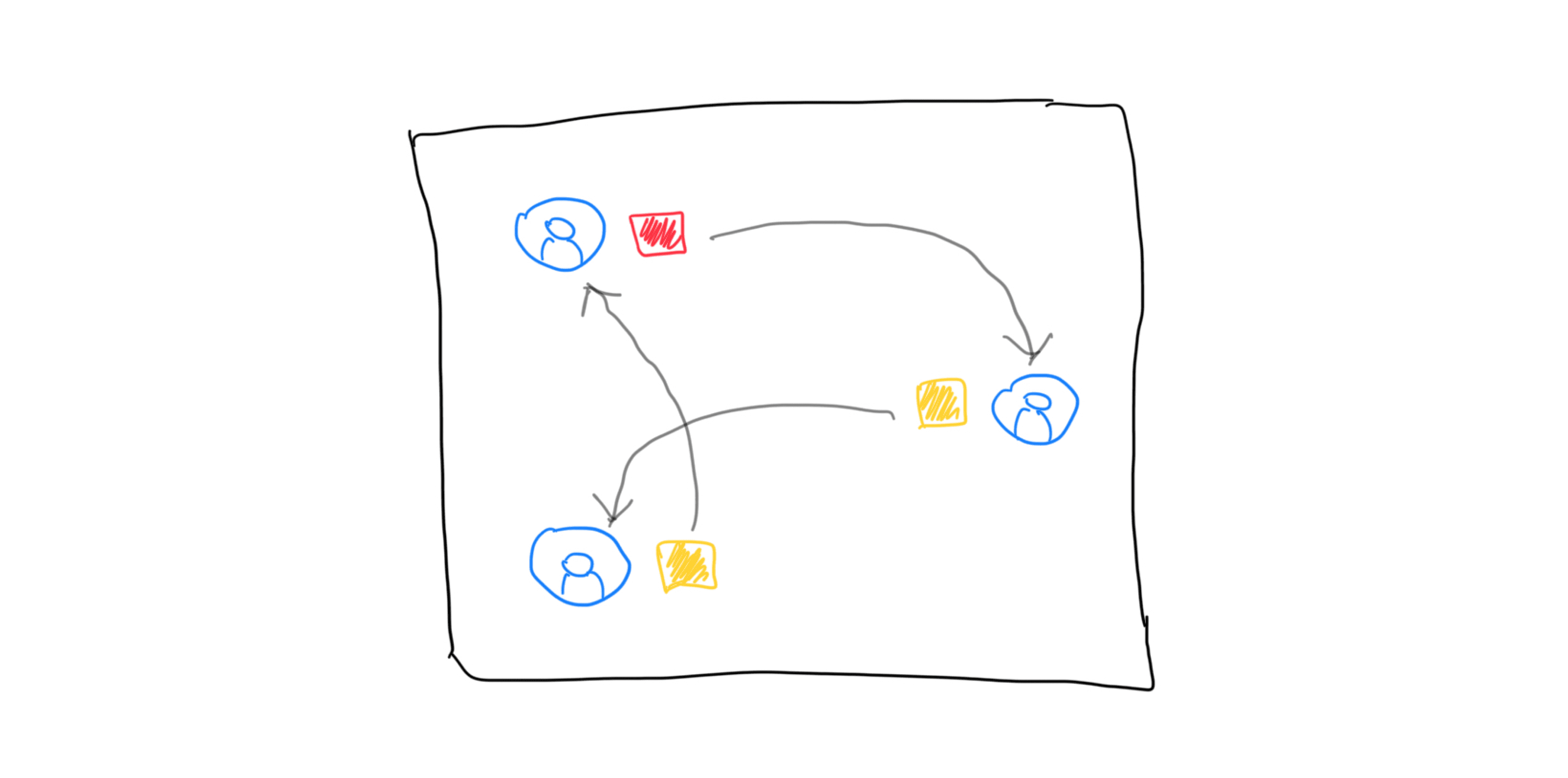
6. Team Sharing and Collaboration:
Enable easy sharing of alerts among team members.
Implement account-based visibility for alerts meant for specific users.
Competitive analysis
To better understand how to reduce user time in browsing and analyzing alerts/violations, we conducted a quick analysis of the functionalities and workflows provided by our competitors.
This analysis also helped us identify pre-existing design trends, given that users often use a combination of these products.
We focused on three leading observability platforms: New Relic, DataDog, and Dynatrace.
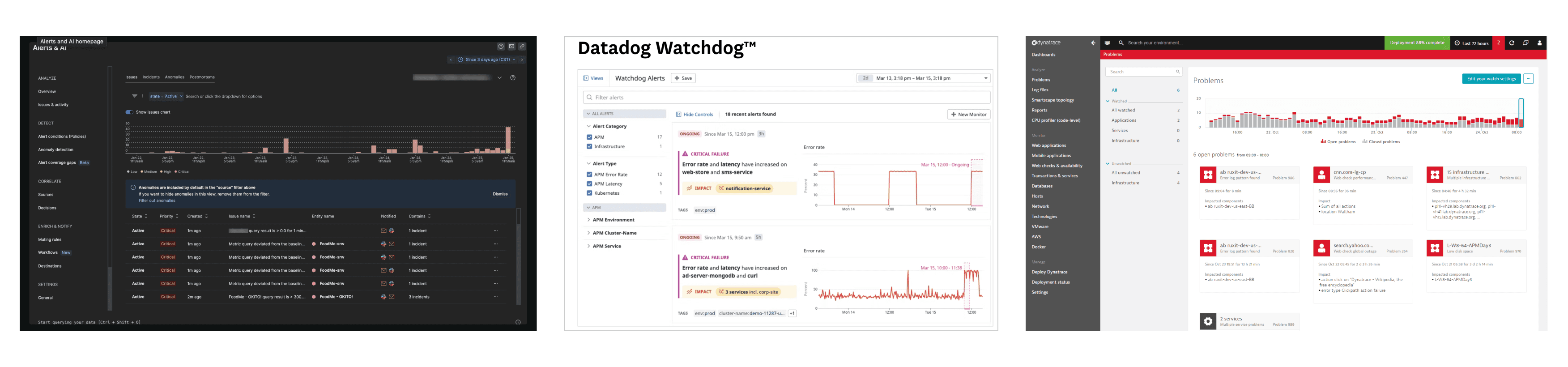
Key Insights:
1. Alerts Dashboard or Alert Listing Page: It is a common practice to display and visualize alerts within the system through a centralized dashboard or listing page.
2. Alert Correlation: Correlating different alerts is promoted to minimize alert noise and provide a clearer understanding of related issues.
3. Single Page Alert Details: Major information about alerts is often consolidated into a single page, providing comprehensive details in one place.
4. Charts and Timelines: The use of charts and timelines helps visualize data and enhances the ability to scan and interpret information quickly.
Note:
Given that troubleshooting is a broad and open-ended process, we clearly defined our project objective. We aim to avoid mixing or confusing the Alert Explorer with troubleshooting-specific views. The Alert Explorer is designed as an entry point to provide comprehensive information about an alert before users begin the troubleshooting process.

Ideation
Using the identified opportunity points, I started writing Jobs to Be Done, focusing more on the outcomes rather than just features.
I divided these into two categories:
1. Functional Jobs to Be Done: These focus on the specific functionalities needed in the system.
2. Emotional Jobs to Be Done: These address the user's underlying motivations and intentions, helping us understand what drives them.
Till here, I did a lot of diverging process. Enabled myself to understand the context and a lot of user requirements / problems. Now from here it was time to converge.
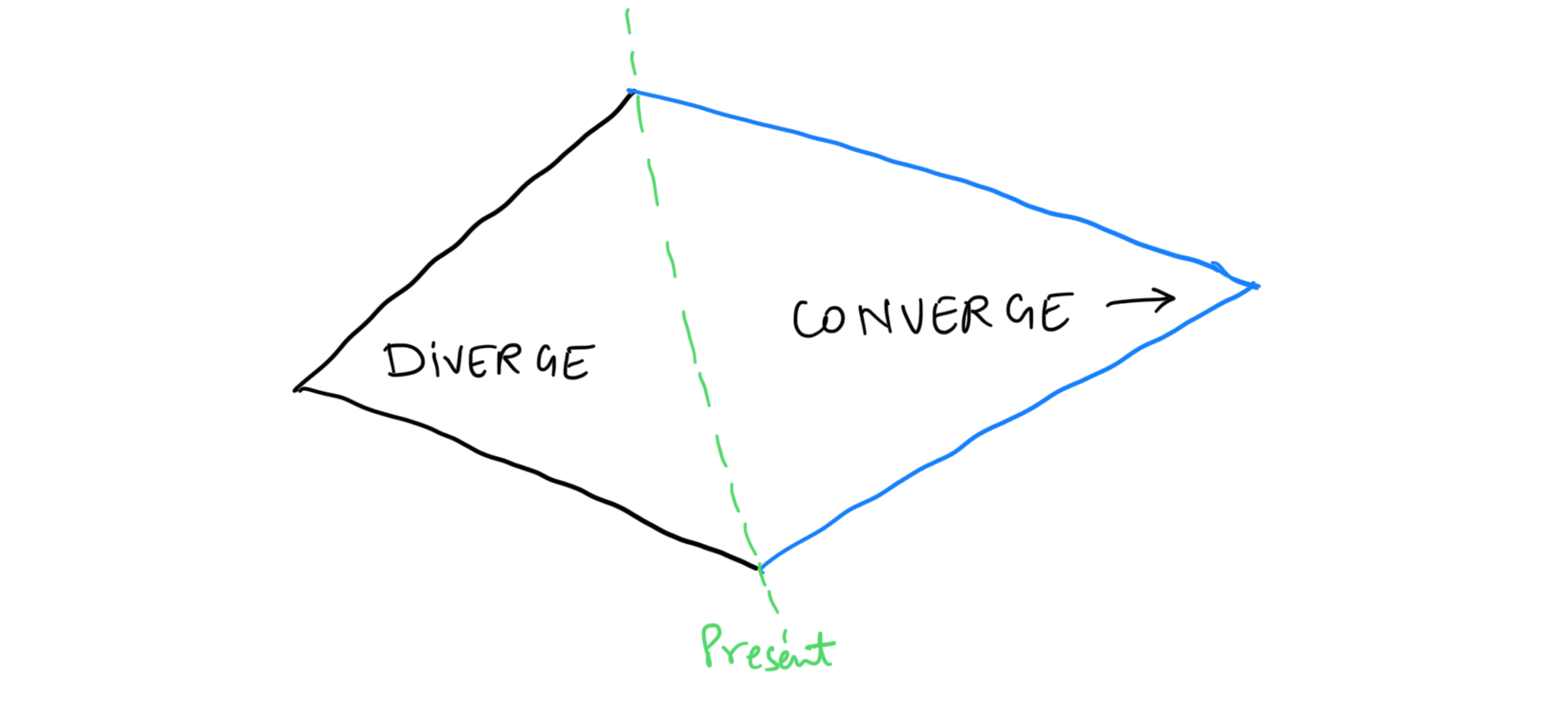
I held a collaborative brainstorming session with the PM to discuss our research and Jobs to Be Done. From this, we identified key functionalities as per best end-to-end experience and Product prioritisation in the "Alert Explorer."
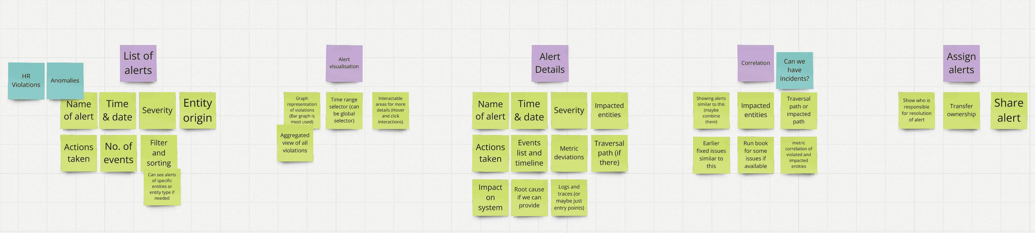
List of alerts
Filtering and sorting in the list
Alert visualization
Alert details
Alert correlation
Assigning alerts to resolve
We also did a small workshop to detail out what data can be shown in each functionalities.
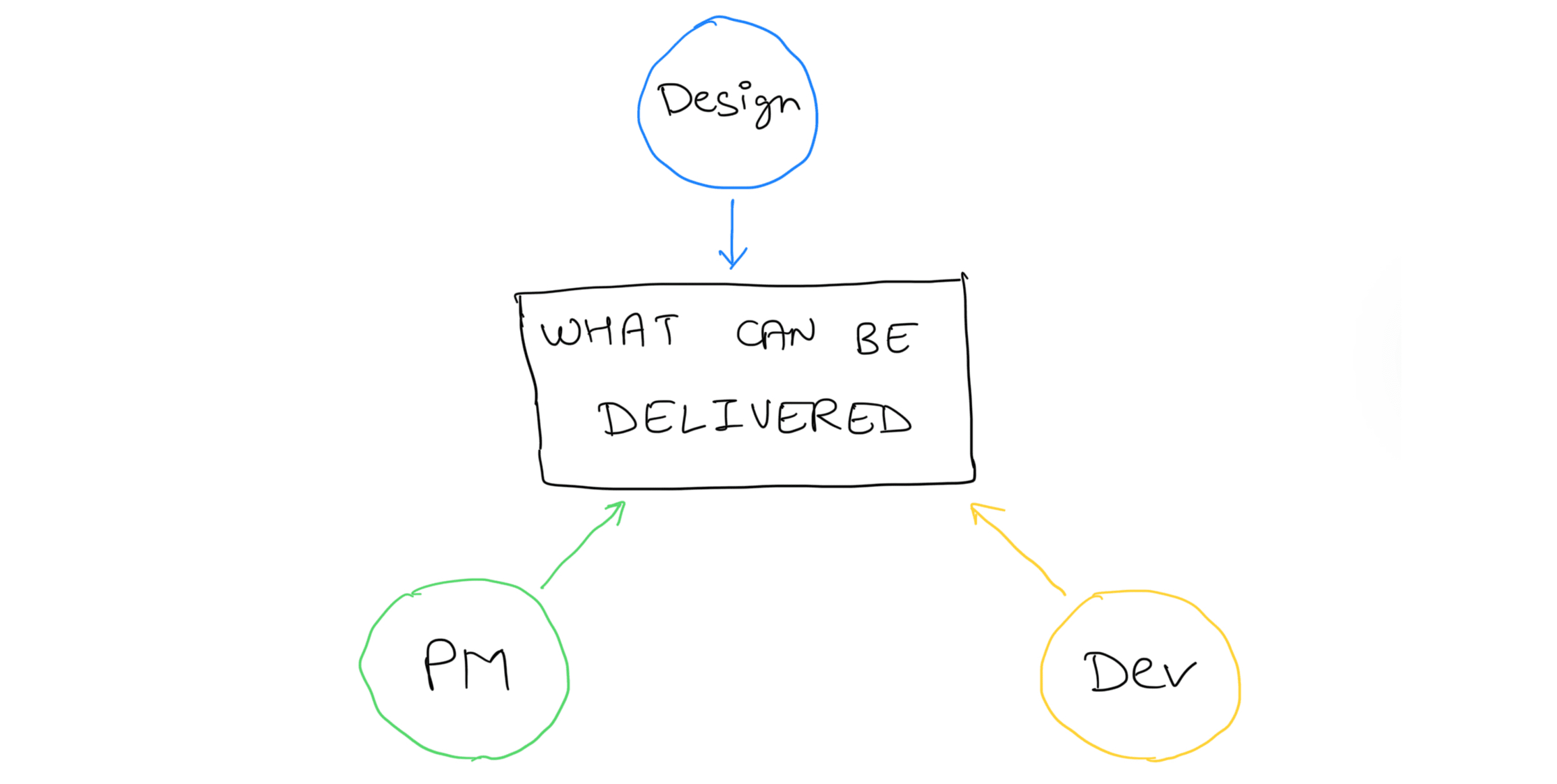
At this stage, we needed to define what we would deliver in the first release. Not all features and flows we envisioned might be feasible immediately. It was crucial to collaborate with developers to understand the platform's capabilities and any potential constraints.
A simple Effort vs Value chart was created for these functionalities
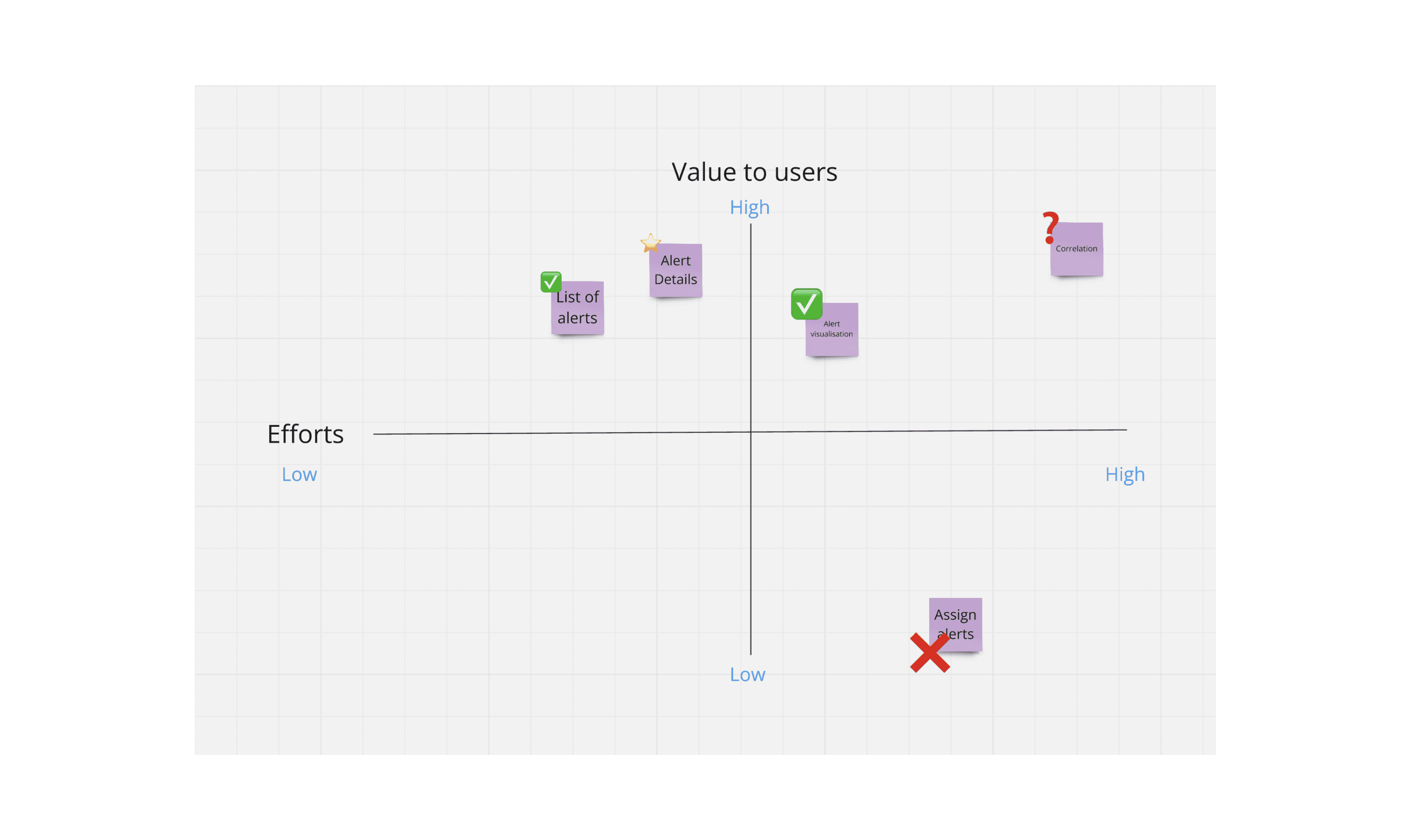
For first phase, we decided to move ahead with:
1. Alert listing
2. Alert Details
3. Alert visualisations
4. Some aspects of that correlation could be achieved.
Initial Designs
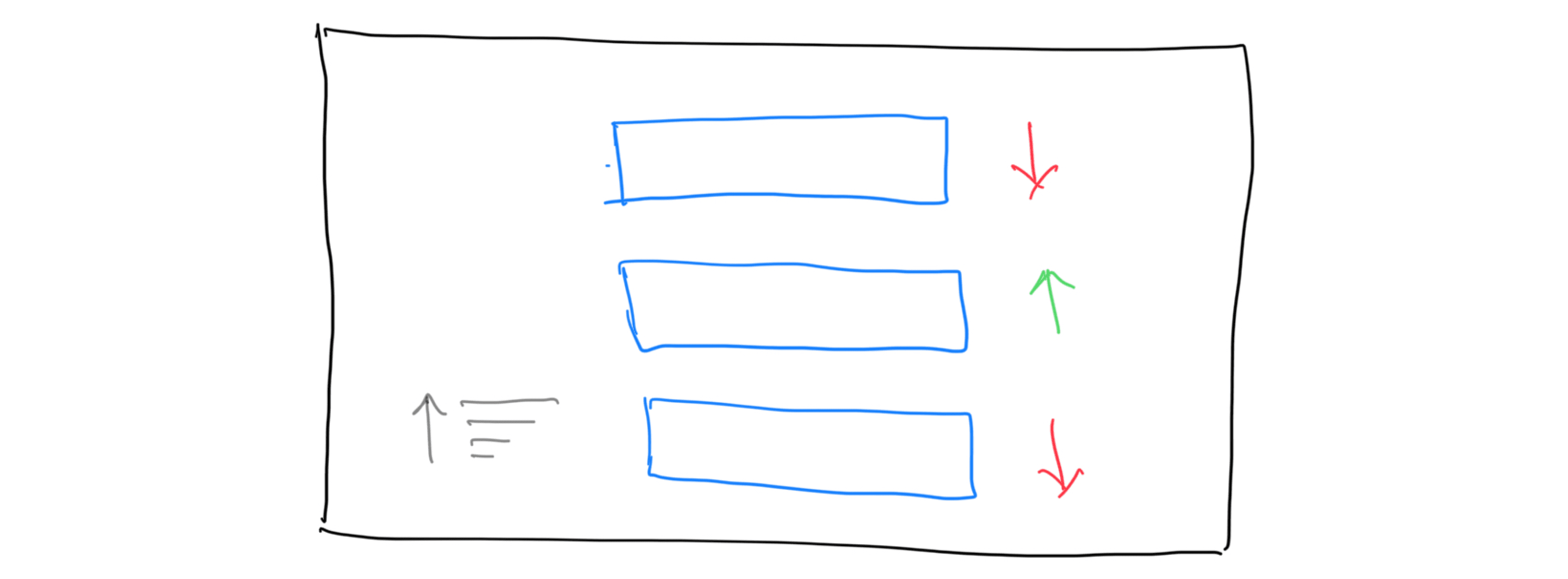
I began by creating a basic low-fidelity template to visualise how the Alert Explorer might look:
I refined the low-fidelity templates into high-fidelity mockups, adding detailed design elements and interactions to provide a clearer picture of the final user interface.

User Testing
We presented these designs in a quick moderated user research session to gather feedback on several key areas:
1. Validation of Concept: Is the concept clear and relevant to the users?
2. Understanding of Visualization and Alert Dashboard: Do users understand the visualization and layout of the alert dashboard?
3. Prioritization of Alerts: What information do users rely on to prioritize alerts?
4. User’s Next Steps: What details do users need to proceed to the next steps in their workflow?
5. User Mental Model: How do users mentally organise and correlate data related to alerts?
6. Building Trust: How can we establish and enhance user trust in the system?

Key Insights:
1. Importance of Alert Dashboard: Users highly value an Alert dashboard, as it allows them to view all current issues in a single place.

2. Filter Interface Issues: The filter UI looked like a code block, making users hesitant to use it, even though it was just key-value pair filtering.

3. Prioritisation Data: While relevant data for prioritising alerts varied among users, the top 4-5 criteria were consistent for everyone.
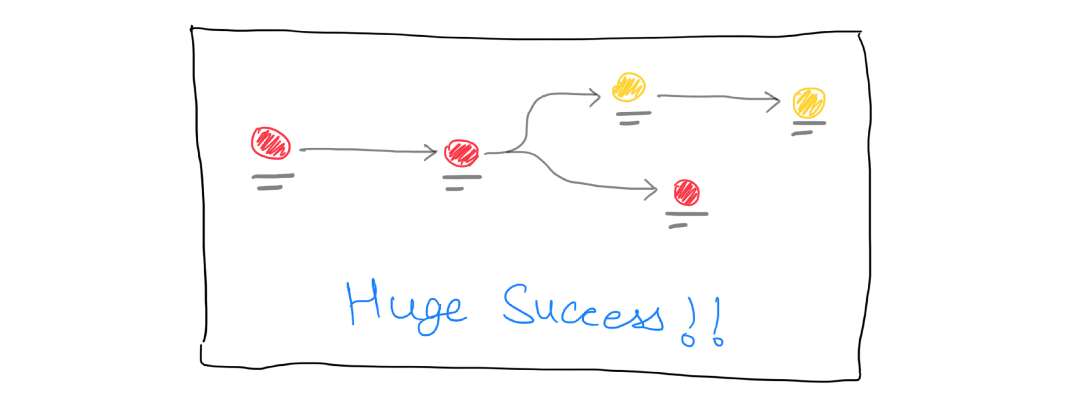
4. Traversal Path Importance: Participants really appreciated the cut-down of steps identifying the traversal path in which the error existed. Participants expressed that the concept would cut down a huge chunk of their time as the presented data in the violation detail page would take them many steps and arrive at a diagnosis. (Huge Success)
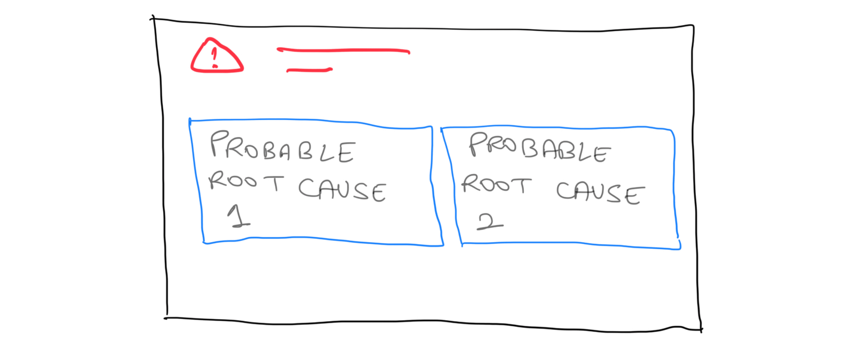
5. Root Cause Analysis: Users expressed a desire to see root cause analysis for current alerts.
6. Metric Information Clarity: Users struggled to understand metric information and needed more clarity and correlation in this area.

Key Design Decisions:
Filter Interface Update: The filters on the listing page were updated to more recognizable patterns, providing greater flexibility and quicker access.
Enhanced Metric Information: Additional details about metrics were included on the detail page, along with exploring ways to correlate different metrics.

User Testing 2
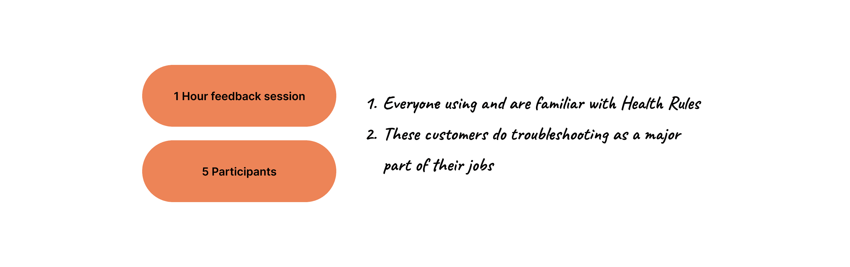
After making these quick changes, we conducted another round of user testing with actual customers who use other observability tools instead of AppDynamics. The agenda for this user testing was the same as the previous one
Key Insights:
1. Quick Filters:
Users appreciated the quick filters feature and believed it would help reduce time spent on the screen. However, they requested additional filter options.
2. Customisation:
Users wanted more flexibility in choosing what to focus on regarding violations. They suggested adding the ability to shuffle columns left and right to facilitate easier analysis and prioritization.
Information such as the impact on users was highlighted as particularly relevant for prioritizing violations.
3. Detailed Information:
Users were pleased with the depth of information on the details page.
They suggested rearranging some of the information to better match their priorities but did not feel the need to add any additional information.
4. Metric Comparison:
Metric comparison was important, but users preferred the metric deviation timeline over the comparison view.
The timeline provided a clearer understanding of the overall system and how issues developed.
Final Design Decisions
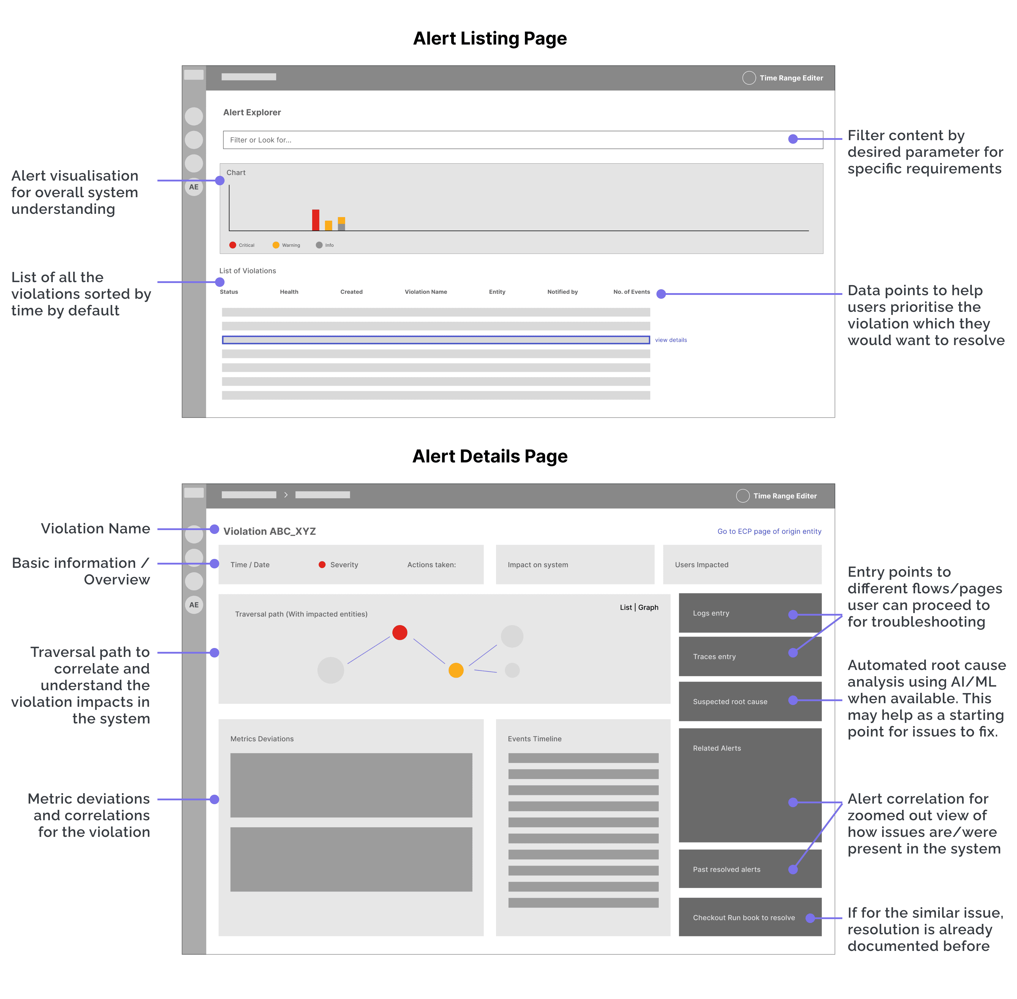
Alert Listing Page:
1. Quick Filters: Updated filters to include more generic categories:
Data Severity (Warning, Critical, Info)
State (Open, Closed)
New vs Frequent Alert
Business Impact (High, Medium, Low)
End User Impact (High, Medium, Low)
Entity Namespace (k8s, apm, aws, infrasec, etc.)
2. Common Filters: Added additional filters such as
Entity Type
Alert Name
Entity Tags
Entity Attributes
3. System Overview:
Added an overview section to provide better visibility and understanding of the system's status.
4. View Options:
Introduced a "View options" action in the violations data grid to allow users to customise the data points they want to see
5. Grouping and Impact Columns:
Added a "Group by" action in the violation list.
Included a "Users impacted" column in the data grid for better prioritisation.
Alert Details Page:
1. Data Hierarchy:
Organised the details page into two main sections: Diagnostics & Remediation.
Diagnostics: Provides an overview of the alert.
Remediation: Suggests actions and offers data correlation.
2. Vertical Stacking:
Implemented vertical stacking of information for better correlation of data and timelines.
3. Additional Information:
Included root cause information, correlated alerts, and recommendations to facilitate quick next steps for users.
Final design and visual refresh
Updated the visuals with Cisco’s Magnetic UI guidelines
Impact

Key Learnings
Collaborative Decision-Making: Involving developers and stakeholders early on smooths decision-making and reduces the need for rework.
Early User Research: Conducting user research and testing in the early stages ensures the design aligns with user needs.
Evolving Projects: Projects that impact the entire product are constantly evolving. It’s important to start with delivering the essential features, and recognise that there is always room for improvement.
Balancing Complexity and Simplicity: Enterprise design doesn’t always need to be data-heavy. It’s crucial to understand user scenarios and simplify when necessary, aiming for the right balance between complexity and usability.